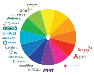
What Color Branding is Healthcare?

Introduction
The Impact of Color in Healthcare Branding
When it comes to branding, colour is extremely important in many different fields, and the healthcare industry is not an exception. When it comes to branding in the healthcare industry, choosing the appropriate colours can have an impact on how people view a brand, as well as build a feeling of trust and reliability. Colours have the ability to stimulate certain feelings and trigger mental associations, both of which can have a significant impact on the patient’s experience as a whole. Let’s investigate the significance of colour in healthcare branding in further depth. Kick ass dental here.
Blue: Symbolizing Trust and Stability
The colour blue is utilised rather frequently in the branding of healthcare-related products. The colour blue is frequently regarded as signifying dependability, trustworthiness, and security. It instills a sense of serenity as well as reliability, both of which are essential qualities in the healthcare business. Numerous well-known healthcare companies, such as Blue Cross Blue Shield, use varying shades of blue in their logos and other branding elements in order to communicate a sense of reliability and competence to its customers.
Green: Representing Healing and Growth
The colour green is frequently linked to the outdoors, fitness, and overall health and happiness. It is a representation of expansion, harmony, and rebirth. Green is a colour that is widely utilised in the branding of healthcare services because it gives off an impression of compassion and healing. It is common practise for hospitals and other providers of healthcare services who emphasise holistic or alternative treatments to use the colour green in their branding in order to cultivate an atmosphere that is calming and caring for patients.
Red: Signifying Urgency and Vitality
When it comes to branding for healthcare, the colour red is frequently utilised to convey a sense of vibrancy and urgency. It is a vibrant and eye-catching colour, which makes it an excellent choice for use in efficient methods of attracting attention to vital details or calls to action. In order to convey a sense of urgency and the significance of prompt action, blood donation centres and emergency medical services frequently make use of the colour red in their branding.
Purple: Conveying Sophistication and Creativity
The colour purple has come to symbolise opulence, originality, and enlightenment. When it comes to branding for healthcare, the colour purple may be utilised to communicate both innovation and sophistication. For the purpose of developing a distinctive and easy-to-remember corporate identity, many companies that provide specialised or high-end healthcare services opt to use it.
Yellow: Energetic and Optimistic
Yellow is a cheerful, upbeat, and optimistic colour that exudes vivacity and vitality. This colour is frequently connected to happiness. When it comes to branding for healthcare, the colour yellow can be utilised to evoke feelings of friendliness and warmth. It is frequently utilised by paediatric clinics and other healthcare providers who want to cultivate a cheery and uplifting environment for their young kids in order to better serve those patients. For professional medical web design see here.
Conclusion
In summing up, the importance of colour branding in the healthcare industry cannot be overstated. A person’s reaction to a brand can be influenced by the colours used in its marketing, as some hues are known to elicit specific feelings in consumers. Each colour can be strategically used to create a one-of-a-kind and influential healthcare brand; for example, the colour blue is associated with trust and stability, the colour green symbolises healing and growth, the colour red conveys the sense of urgency and vitality, the colour purple conveys sophistication and creativity, and the colour yellow represents energy and optimism. The ability of healthcare organisations to effectively connect with patients, build trust, and provide a great experience for patients can be facilitated via the thoughtful selection and application of colours in branding.


