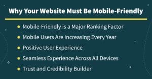
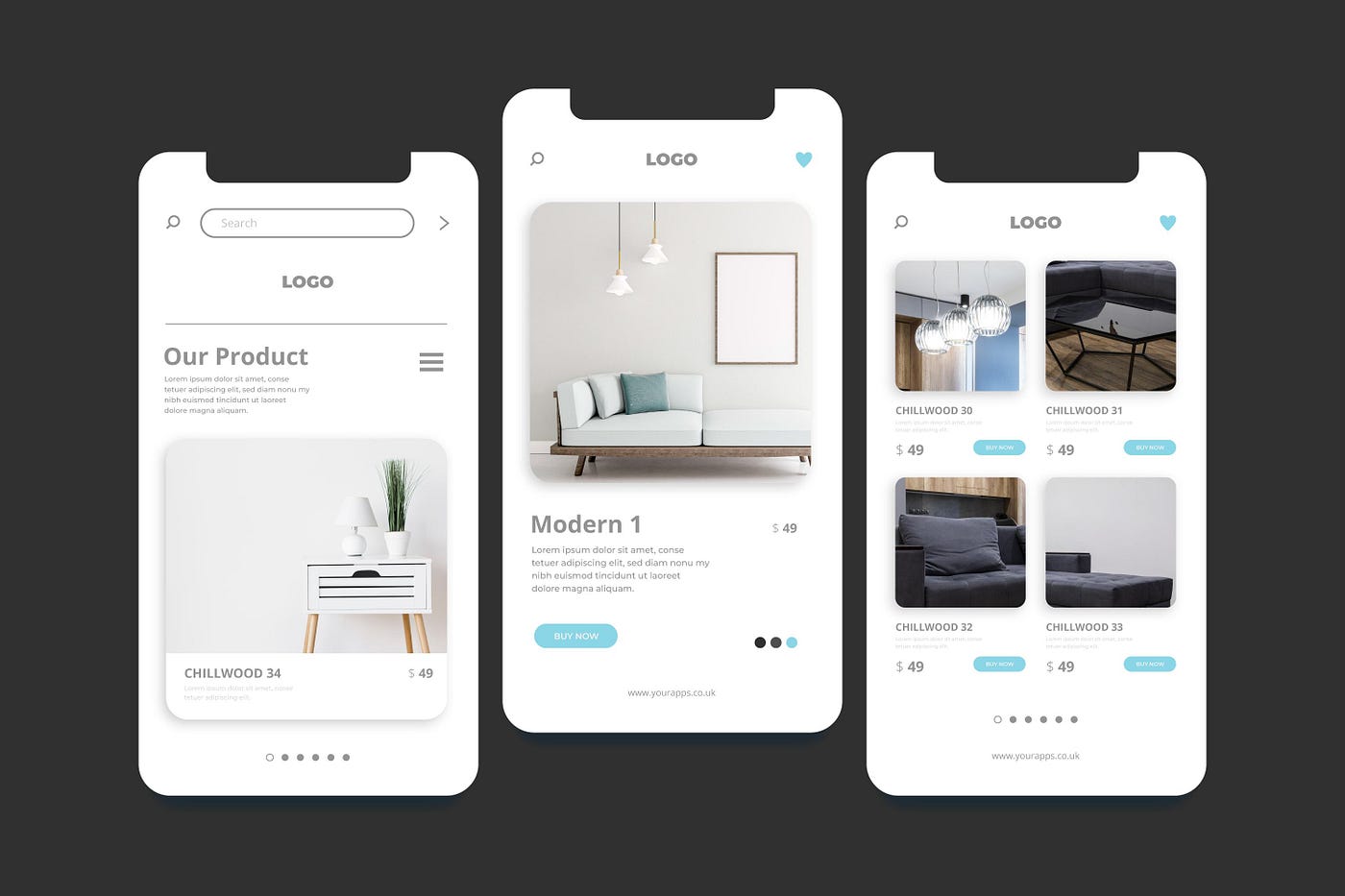
In this day and age, it is absolutely necessary to have a website that is compatible with mobile devices in order to attract a larger audience and improve the overall user experience. Because the vast majority of people who use the internet access websites through their mobile devices, optimizing your website for mobile use is no longer a desirable decision; rather, it is an absolute need. What follows are ten vital tips for designing a website that is mobile-friendly, which will assist you in efficiently engaging and retaining users to your website. https://diversewebsitedesign.com.au/iphone-app-development/
1. Implement Responsive Web Design
Why Responsive Design is Important
The use of responsive web design into your website ensures that it can adjust to different screen sizes and resolutions. The use of this strategy makes it possible for your website to appear and perform properly on a wide variety of devices, from desktop computers to smartphones.

How to Implement Responsive Design
Utilizing flexible grid layouts, flexible images, and media queries are all necessary components for implementing responsive design. The provision of pre-designed responsive components is one way in which CSS frameworks such as Bootstrap and Foundation can make this process more straightforward.
2. Optimize Page Load Speed
Importance of Fast Loading Times
The patience of mobile users is typically limited when it comes to websites that load slowly. A website that loads quickly not only enhances the user experience but also increases your search engine optimization rankings.
Tips for Speed Optimization
Caching in browsers should be enabled, and content delivery networks (CDNs) should be utilized. The use of heavy graphics and videos should be minimized. You are able to identify and resolve speed-related issues with the assistance of tools such as Google PageSpeed Insights.
3. Simplify Navigation
Designing User-Friendly Menus
A navigation system must to be easy to understand and basic. Users can become frustrated with complex menus, which can lead to an increase in bounce rates.
Best Practices for Mobile Navigation
Use a straightforward, collapsible menu, sometimes known as a hamburger menu, that makes navigation easy to reach while being inconspicuous. Always make sure that the buttons and links on a touch screen are of a size that allows them to be readily tapped.
4. Prioritize Content Over Design
Content is King
Information is often sought for by mobile users in a prompt and effective manner. Set your material at the top of your priority list to guarantee that it is easily accessible and readable.
How to Prioritize Content
Make use of headlines, bullet points, and paragraphs that are brief and to the point. To prevent making the screen look cluttered with design elements that aren’t necessary, make sure that the most critical information is displayed at the top of the page.
5. Use Large, Readable Fonts
The Role of Typography in Mobile Design
Fonts that are either too small or too complicated can be difficult to read on screens that are smaller. In order to keep users interested and engaged, it is essential to make sure that your writing is readable.

Utilize a font size that is at least 16 pixels in size. Make sure there is sufficient contrast between the text and the background, and select fonts that are simple and sans-serif. To improve readability, there should be sufficient space between lines.
6. Ensure Touch-Friendly Interface
Designing for Touch Screens
Because mobile devices rely on touch input, the interactive aspects of your website need to be compatible with touch input techniques.
Creating a Touch-Friendly Interface
Ensure that there is sufficient distance between interactive elements to prevent unintentional touches. Make sure that buttons and links are large enough for users to tap without difficulty, typically at least 44×44 pixels.
7. Avoid Flash and Pop-Ups
The Downsides of Flash and Pop-Ups
A significant number of mobile devices do not support Flash, and pop-ups have the potential to disturb the user experience, which can result in annoyance and an increase in user bounce rates.
Better Alternatives
Flash should be replaced with HTML5 when it comes to multimedia content. To avoid obstructing the user’s view, pop-ups should be replaced with banners or material that is displayed in-line.
8. Optimize Images and Multimedia
The Impact of Multimedia on Performance
Images and videos that are too large will dramatically slow down your website, which will have a negative impact on the user experience on your website.
Strategies for Optimization
In order to compress images, you can use programs such as TinyPNG or JPEG Optimizer. Make sure to use the appropriate file formats (for example, WebP for photos) and implement lazy loading in order to delay the loading of images and videos that are not absolutely necessary.
9. Utilize Mobile-Friendly Forms
The Importance of User-Friendly Forms
The completion of forms on mobile devices can be difficult if they are not designed appropriately, despite the fact that forms are an essential component of many websites.
Designing Mobile-Friendly Forms
Forms should be kept brief and should only ask for information that is needed. Input fields should be large, the keyboard type should correspond to the input field (for example, a numeric keyboard should be used for entering phone numbers), and clear labels and instructions should be provided.
10. Test Your Website on Multiple Devices
The Necessity of Thorough Testing
It is important to test your website on a variety of browsers and devices to verify that it performs properly for all users.
How to Conduct Effective Testing

For testing the performance of your website, you can make use of applications such as Google’s Mobile-Friendly Test, BrowserStack, and Responsinator. Your website should be checked on a regular basis using a variety of browsers, operating systems, and devices in order to discover and fix any problems that may arise.
Conclusion
It is crucial in today’s digital landscape to create a website that is compatible with mobile devices. You are able to dramatically improve the user experience by using responsive design, minimizing load times, simplifying navigation, giving content priority, and ensuring that interfaces are touch-friendly. In addition to avoiding Flash and pop-ups, optimizing photos, utilizing forms that are mobile-friendly, and conducting comprehensive testing, you may further ensure that your website is able to satisfy the requirements of mobile users. If you adhere to these ten fundamental guidelines, your website will be well-equipped to give a smooth and pleasurable experience for each and every visitor.


