2025 Colour Palettes for Web Designers That Actually Convert
In 2025, web design is more dynamic and emotionally driven than ever. With attention spans shorter than ever and competition on the rise, your website’s color palette plays a crucial role in not just aesthetics—but in conversion. Whether you’re designing a sleek SaaS dashboard, a vibrant eCommerce site, or a calming portfolio, the right combination of hues can influence user behavior and elevate your brand’s impact.

This guide covers the best-performing color palettes in 2025, grounded in both visual trends and psychological data that actually drive engagement and sales.
Why Colour Palettes Matter More Than Ever
Color influences emotion, trust, and action. According to recent UX research, users form an opinion about a website in just 50 milliseconds—and color is the first thing they register. With more brands moving online and customer expectations rising, web designers need to align color choices with strategic goals.
The Psychology Behind Colour and Conversion
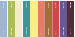
Different colors evoke different responses. Here’s a quick recap:
Red: Energy, urgency, power – ideal for CTAs and flash sales.
Blue: Trust, security, calmness – great for financial or tech brands.
Green: Balance, growth, eco-friendliness – used for wellness or sustainability.
Yellow: Optimism, creativity, attention-grabbing – perfect for youth brands.
Black & White: Minimalism, luxury, sophistication – ideal for high-end or creative industries.
Pairing these thoughtfully enhances UX and motivates action.
Top Colour Palette Trends for 2025
Designers in 2025 are ditching harsh contrasts in favor of softer, psychologically resonant palettes. Let’s explore the ones leading the pack in both style and performance.
1. Digital Zen
Best for: Wellness, SaaS, mindfulness apps
Palette:
Mist Blue (#C9D6DF)
Sage Green (#B4CDBA)
Pale Sand (#F4EDE8)
Soft Charcoal (#545454)
This soft and muted palette creates a calming digital experience. Ideal for users who need to feel focused and relaxed, Digital Zen lowers bounce rates and improves time-on-site.
2. Neo-Pop Vibes
Best for: eCommerce, entertainment, Gen Z audiences
Palette:
Electric Purple (#A259FF)
Bubblegum Pink (#FF66B3)
Neon Lime (#CCFF00)
Deep Navy (#1B1F3B)
Neo-Pop uses high contrast and vibrant hues, but it’s balanced with grounding dark tones. It’s attention-grabbing and drives high click-through rates on interactive UI elements like buttons and sliders.
3. Earthy Modern
Best for: Eco-brands, lifestyle blogs, sustainable fashion
Palette:
Terracotta (#D2691E)
Olive Drab (#6B8E23)
Warm Sand (#E2CFC3)
Clay Grey (#A89F91)
Earthy Modern speaks to values like authenticity and groundedness. It converts well for mission-driven brands, especially where storytelling is key.
4. High-Contrast Minimalism
Best for: Luxury, design portfolios, editorial sites
Palette:
Pure White (#FFFFFF)
Jet Black (#000000)
Metallic Gold (#D4AF37)
Charcoal Grey (#333333)
Minimal palettes with luxury accents continue to dominate in 2025. This aesthetic boosts user trust and perceived value, which is perfect for premium products or services.
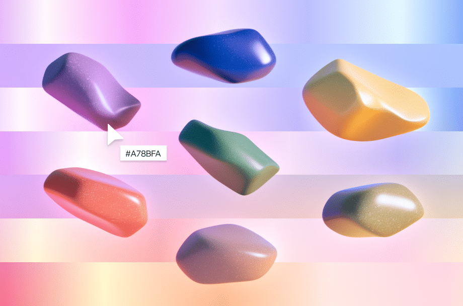
5. Cyber Pastels
Best for: Tech startups, crypto, digital art platforms
Palette:
Pastel Cyan (#A3E4DB)
Lavender Mist (#E3DFFF)
Soft Coral (#F9AFAE)
Midnight Blue (#2A2E45)
Combining the lightness of pastels with futuristic contrasts, this palette attracts digitally savvy users. It’s playful but still professional enough for fintech and SaaS.
How to Choose the Right Colour Palette for Conversions
It’s not just about what’s trending—it’s about what works for your audience and business goals.
Know Your Brand Personality
Use color psychology as a baseline. A cybersecurity startup shouldn’t use pastel pink as its primary tone. Conversely, a kids’ toy shop might not perform well with monochrome minimalism. Always match palette to brand tone.
Define Your Conversion Goals
Different palettes serve different purposes. For example:
To reduce bounce rate: Use warm, inviting colors with soft transitions.
To increase sales: Use urgency colors like red and orange in CTAs.
To boost engagement: Use playful palettes that invite exploration.
Test Your Palette
A/B testing color schemes can dramatically improve conversion rates. Try changing button colors, background hues, or even theme modes (light vs dark) to see what drives user action.
Don’t Forget Accessibility
Ensure your palette meets WCAG standards. High-contrast text and accessible hues (like avoiding red-green combos) are key for usability and inclusivity.
Tools to Help You Craft High-Converting Colour Palettes
Here are some designer-favorite tools for 2025:
1. Coolors.co
Quickly generate trendy palettes and test contrast with ease. Includes export options for design tools like Figma and Adobe XD.
2. Khroma AI
Uses AI to learn your aesthetic preferences and suggests palettes that align with your style. Excellent for creating custom schemes.
3. Adobe Color
Perfect for fine-tuning brand-specific tones and accessing trend libraries directly from Adobe Creative Cloud.
4. Contrast Checker by WebAIM
Ensure all elements on your site are readable by checking your foreground and background color combinations for accessibility compliance.
Final Thoughts: Colour is a Conversion Tool, Not Just a Style Choice
In 2025, web design isn’t just about how good a site looks—it’s about how well it performs. Your choice of color palette can directly influence a user’s path through your site, from first impression to final click. By aligning your colors with emotion, usability, and brand messaging, you’ll not only keep users engaged—you’ll convert them.
So whether you’re leaning into soft neutrals or vibrant neons, remember: a smart color choice isn’t a design decision. It’s a business one.