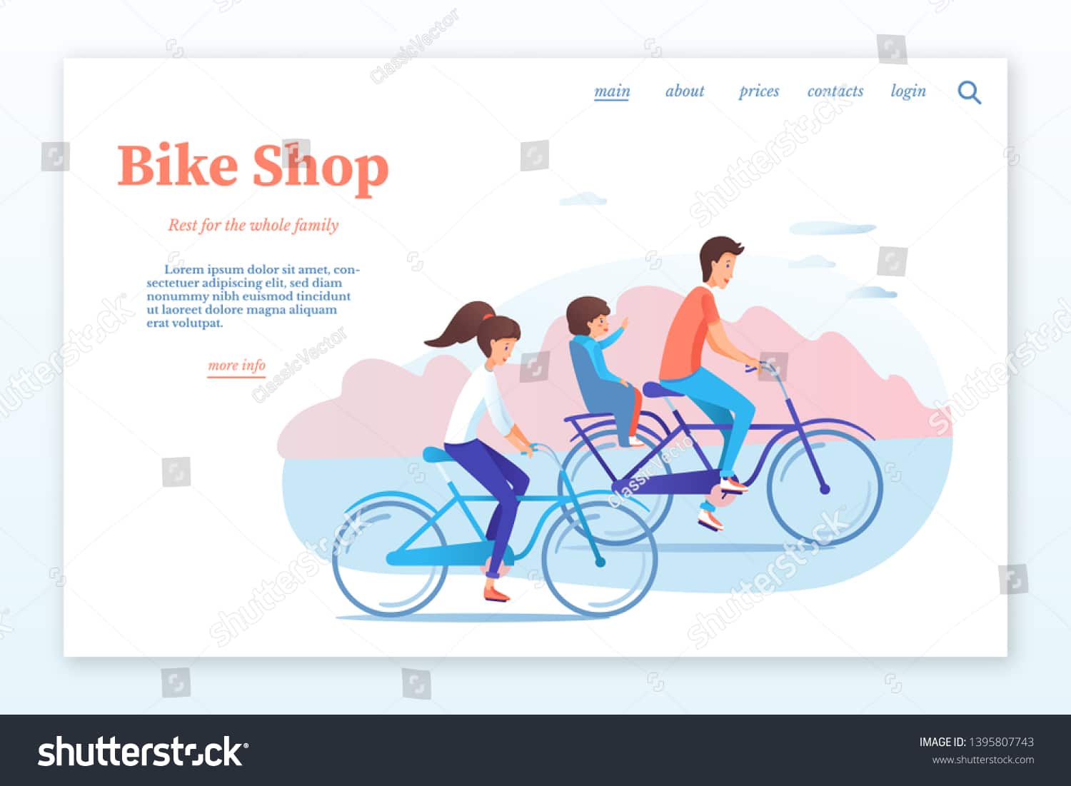
In this day and age, the core of your bicycle shop’s online presence should be a website that is both functional and attractive. The digital storefront is the first thing that potential consumers see, and it plays a crucial role in determining whether or not they will explore the rest of your products. As more people turn to the internet for information and commerce, the importance of designing a website that is both aesthetically pleasing and easy to navigate has skyrocketed. In this piece, we’ll delve into the world of bicycle store website design and provide you with helpful ideas and pointers to assist you in crafting a site that not only stands out but also drives sales. Find bicycle shop website designs here.
Aesthetic Appeal: The First Impression
First impressions are extremely important in the world of internet interaction. The design of your bicycle shop’s website is the very first thing that potential customers see when they visit your site for the first time. A website that is appealing to the eye has the potential to immediately attract visitors and bring them into your world of bicycles and accessories. On the other hand, a website with poor design can quickly lose their interest.
Consider the following aspects of your website in order to guarantee that it emits the appropriate visual appeal:
Color Scheme and Branding
Your brand identity and color palette should be completely congruent with one another. The use of earthy tones, greens, and blues in a bicycle shop can help customers feel more connected to the outdoors, adventurous, and environmentally conscious. Maintaining cohesiveness and an air of professionalism throughout your website can be accomplished by using the same color palette throughout.
User-Friendly Navigation
When designing a website for a bicycle business, ease of use is of the utmost importance. Your website’s navigation menu has to be user-friendly and uncomplicated in order to make it simple for site users to obtain the information they require. Create meaningful classifications for your goods, such as “mountain bikes,” “road bikes,” “accessories,” and “apparel,” for example. To make the browsing experience easier, put in place labels that are easy to see and, if necessary, employ drop-down menus. Read more about it here.
Responsive Design: A Must-Have
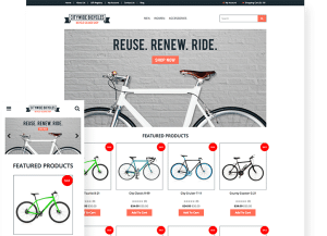
Because more and more people are using their mobile devices to browse the web and shop online, having a design that is responsive is really necessary. Your content and photos will look great on mobile devices, tablets, and desktop computers if you choose a website that is responsive since it automatically adjusts to fit the screen size of the device being used. This responsiveness not only improves the user experience but also has a favorable impact on your search engine rankings, particularly on Google, which gives preference to websites that are suitable to mobile devices.
Mobile Optimization
In addition to being responsive, your website should also be optimized for people using mobile devices. It is important to make sure that the buttons and links on the website are easy to tap, that the text can be read without having to zoom in, and that the page loads quickly even on slower mobile connections. The increased user pleasure that results from mobile optimization can potentially lead to higher conversion rates.
High-Quality Imagery: Showcasing Your Products
When it comes to the business of selling bicycles, a picture really is worth a thousand words. It is necessary to have photographs of your bicycles, gear, and accessories that are of a high quality in order to attract customers. Make an investment in high-resolution product photographs or professional photography so that each and every detail can be seen. It could be a good idea to incorporate zoom functions so that shoppers can examine products more thoroughly.
Lifestyle Photography
Include lifestyle pictures that demonstrates how your bicycles may be used in various settings. These graphics let potential customers picture themselves riding your items, whether it’s a mountain bike tackling challenging trails or a sleek road bike gliding along scenic routes. A personal connection can also be established through lifestyle photos, which increases the likelihood that site visitors will make a purchase.
Compelling Content: Inform and Engage
The design of a website for a bicycle shop should place an emphasis not only on visually appealing elements but also on informative and useful content. Not only can you educate your audience with informative product descriptions, blog pieces, and how-to instructions, but you can also brand yourself as an authority figure in the field. Your search engine optimization (SEO) efforts can also be improved by including content that is engaging, which will drive organic traffic to your website.
Blog and Resources
Create in-depth and compelling product descriptions that highlight the distinctive qualities and advantages offered by each type of bicycle and accessory. When assisting clients in the decision-making process, it is helpful to use language that is clear and simple, as well as to provide size guides and specifications.
Seamless Checkout Process: Reduce Cart Abandonment
Keep a blog or a part of your website dedicated to resources updated often. Discuss helpful cyclic hints, how-to maintenance instructions, and the most recent developments in cycling industry trends and technologies. Not only does posting new information on a consistent basis keep your audience interested, but it also encourages repeat visits.
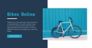
Reduce Shopping Carts That Are Left Unattended by Providing a Seamless Checkout Process
A checkout procedure that is simplified and easy to use is essential to lowering the percentage of shoppers who abandon their carts. Make sure that your consumers are able to make their purchases with the least amount of difficulty and aggravation possible.
Guest Checkout Option
Make it possible for customers to check out without having to create an account by providing a guest checkout option. Although it is beneficial to collect data from customers, requiring registration can discourage people from making a purchase. Give them the option to register for an account after the sale is finalized, but don’t delay in allowing them to finish their purchase as swiftly as possible.
Multiple Payment Options
Make a number of different payment methods available to customers, such as credit cards, digital wallets, and PayPal. Customers are more likely to find a payment method that is convenient for them if multiple options are shown, which in turn reduces the number of abandoned shopping carts. https://www.theebikespecialist.com.au//
Reviews and Testimonials: Build Trust
Your bicycle shop’s ability to garner trust and credibility from happy consumers through the use of positive reviews and testimonials is essential. Put these in a prominent location on your website to reassure those who might buy from you.
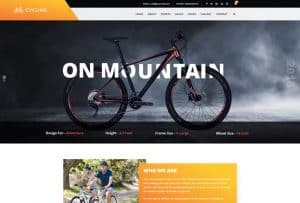
User-Generated Content
Customers should be encouraged to share their experiences with your items by writing reviews and sharing their feedback. Displaying these user-generated reviews alongside those written by professionals will help establish a more accurate and complete image of the quality and performance of your items.
The success of your bicycle shop can be considerably impacted by the quality of the website that you create for it. You may construct a website that not only draws in visitors but also turns them into devoted customers by placing an emphasis on the website’s design in terms of its aesthetics, responsiveness, high-quality graphics, interesting content, an easy checkout procedure, and consumer trust. In the cutthroat environment of online retailing, your website is the most powerful tool you have at your disposal to propel your company to new heights. bicycle shop website designs.

