How Should a Website Concerned with Horses Appear
Before we begin:
In this day and age, it is absolutely necessary for any company or group to have their own website; the horse industry is not an exception to this rule. A well-designed website may help you connect with your audience, provide helpful information, and express your love for these wonderful animals. This is true whether you are a horse breeder, trainer, equestrian event organizer, or simply a horse fan wishing to share your enthusiasm. In this piece, we will discuss the essential components that must be included on a horse website in order to guarantee that it not only has an appealing appearance but also performs its function in an efficient manner. What should a horse website look like?
1.Clear and Engaging Home Page
The front page of your horse website serves as the virtual welcome mat for visitors. Because it’s the first thing that people see when they visit your website, it needs to make a great impression and immediately explain what the purpose of your website is. The following are some components that must to be incorporated into your homepage:
1.1 Captivating Visuals
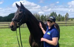
To begin, select an image or slideshow of horses that is of great quality. These pictures ought to be captivating and demonstrate the elegance and allure of the animals featured here. Visuals have the ability to elicit feelings and draw people in.
1.2 Concise Mission Statement
Specify the reason for the existence of your website. Are you a horse breeder who wishes to advertise your stallions? A teacher who is willing to give lessons? Or maybe a website where you can get advice on riding horses? A clear and succinct statement of the mission of the organization helps visitors understand what to anticipate.
1.3 Navigation Menu
Include a navigation menu that is neatly structured, either at the top or on one of the page’s sides. This menu’s purpose is to facilitate the ease with which visitors can navigate the various sections of your website, such as “About Us,” “Services,” “Blog,” and “Contact.”
2.Informative Content
The visitors to your horse website should be provided with information that is helpful to them. This content may be presented in a variety of formats, such as articles, films, or downloaded resources, for example. What you require is as follows:
2.1 Educational Articles
Publish articles on a consistent basis that provide useful information on subjects such as riding, caring for, and training horses. The search engine optimization (SEO) that you do with the help of these articles can help people see you as an authority in the industry.
2.2 Video Tutorials
You might want to think about producing video guides on how to ride, care for, and groom horses and share them online. Videos are a great way to keep visitors interested and can be an effective instructional tool.
2.3 Downloadable Resources
Provide resources that may be downloaded, such as electronic books, checklists, or guides. These can act as lead magnets, allowing you to acquire information from visitors while also providing additional value.
3.Engaging Visuals
Your website ought to make the most of the fact that horses are essentially photogenic creatures by featuring numerous images of them. Engaging visitors and encouraging them to return for more is one of the goals of incorporating visual components.
3.1 High-Quality Photos
Include a photograph collection with a high resolution of horses. You could classify them according to the breed, color, or activity they engage in. When it’s appropriate, be sure to give credit to the photographers.
3.2 Videos and Slideshows
Include films and slideshows that highlight horse competitions, horse training sessions, or even simply horses being horses and having fun. Your viewers may become enthralled by these captivating graphics.

3.3 Infographics
Make use of infographics to effectively communicate vital details, such as those pertaining to horse anatomy, dietary recommendations, or exercise routines. Infographics are easy to understand and share with others.
4.Responsive Design
It is absolutely necessary for your horse website to be responsive in this day and age of mobile phones and tablets. Your website will have a good appearance and perform well on all platforms, from desktop computers to mobile phones, if it has been designed to be responsive.
4.1 Mobile Optimization
Conduct testing of your website on a variety of devices to validate that all of its components are viewable and can be navigated easily. Check to see that the typefaces, photos, and buttons all have the suitable dimensions for mobile screens.

4.2 Fast Loading Times
Improve the loading time of your website. Pages that take a long time to load can result in high bounce rates. Compressing the images and writing code in an effective manner are two ways to speed up the loading process.
5.Engagement and Interaction
A effective equestrian website should encourage audience participation and interaction in order to achieve its goals.
5.1 Social Media Integration
Connect the profiles you use on social media to your website. Guests should be encouraged to follow you on social media channels such as Facebook, Instagram, and Twitter. You can increase traffic to your website by sharing its content on social media.
5.2 Comments and Forums
Make it possible for visitors to leave comments on your articles or establish a forum where horse lovers may debate a variety of issues of interest to them. A sense of community will develop around your website as a result of this. What should a horse website look like?
5.3 Contact Forms
Make it simple for people to get in touch with you when they come to your website. Include many contact methods on your “Contact” page, and make sure you respond to any questions that are asked.
6.Regular Updates
If you want to maintain your audience’s interest and keep them informed, you need routinely update your website with new content.
6.1 Blogging Schedule

Create a timetable for your blog posts and stay committed to it. Building trust with your readers requires maintaining a regular publication schedule for your articles.
6.2 Event Calendar
Keep an up-to-date event calendar if you are involved in the organization or promotion of horse-related activities. Include the dates, the places, and the information necessary to register.
7.Clear Navigation and Structure
The ease with which a website may be navigated is directly correlated to the quality of the experience it provides its visitors.
7.1 Logical Hierarchy
Create a logical hierarchy to organize the stuff you have. Make the material easier to skim and more digestible by breaking it up using headers and subheadings.
7.2 Site Map
Include a site map or search bar to make it easier for visitors to find the material they are looking for. Find what a horse website should look like here.
The final word
In conclusion, a horse website that is effective should have an appealing aesthetic design, provide useful information, and be entertaining. You will be able to construct a website that not only demonstrates your enthusiasm for horses but also functions as a helpful resource for riders and owners of horses all over the world if you pay attention to the fundamental components that are covered in this article. Keep in mind that a horse website that is effectively designed is not only a representation of your dedication to these amazing animals, but it is also an effective tool for interacting with a community of others who share your interests. Get ready to saddle up and launch the perfect version of your horse website right away! https://www.horseland.com.au/


