
Designing for Thumb Zones: Mobile UX in 2025
Introduction
In 2025, designing for mobile isn’t just about responsiveness — it’s about thumbs. As smartphone screens grow and user expectations evolve, the way people physically interact with devices has shifted. Your users aren’t tapping with a mouse or stylus. They’re using thumbs — mostly one — and expecting smooth, intuitive, frustration-free experiences.
Designing for thumb zones is a core aspect of modern mobile UX design, especially as ergonomic interaction plays a bigger role in accessibility, retention, and conversions. If your mobile design isn’t thumb-friendly, it’s not user-friendly.
In this post, we’ll break down:
-
What thumb zones are (and why they matter)
-
How they’ve changed in 2025
-
A step-by-step guide to design for thumb reach
-
Common pitfalls to avoid
-
FAQs to help you master thumb-zone UX
Let’s dive into the anatomy of a great mobile experience.
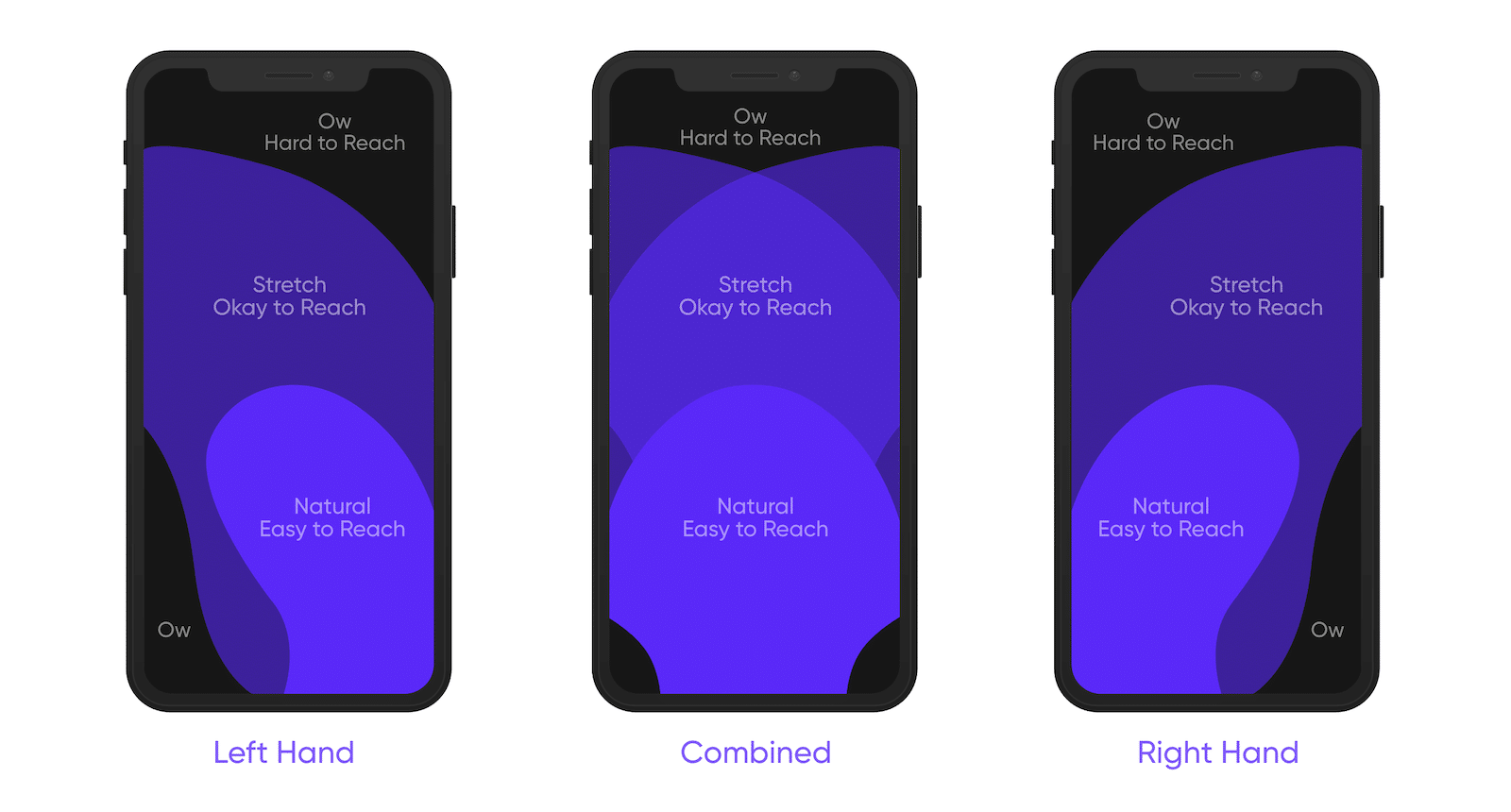
What Are Thumb Zones?
Thumb zones refer to the areas on a smartphone screen that are easiest or hardest to reach with your thumb — especially when holding the phone with one hand.
Coined by UX experts and validated by studies like Steven Hoober’s 2011 research (which found that 49% of people use one thumb to interact with their phones), the concept has evolved over time. In 2025, with larger screens and foldables, thumb zones are more critical than ever.
There are typically three zones:
-
Easy zone: Naturally reachable with a thumb (center to bottom-right for right-handed users)
-
Stretch zone: Reachable with effort
-
Hard zone: Difficult or uncomfortable to reach
Your goal? Place the most important interactions in the easy zone, and keep non-essential elements out of the hard zone.
Why Thumb Zones Matter More in 2025
Here’s why designing for thumb zones is crucial in today’s mobile-first landscape:
-
Screen Sizes Are Larger Than Ever
With many phones now exceeding 6.5 inches, thumb reach is naturally limited. What worked in 2020 doesn’t work now. -
Single-Hand Use Dominates
Despite bigger screens, users often browse, scroll, and tap with one hand — especially on the go. -
Accessibility Is a Priority
One-handed use should be comfortable for everyone, including people with disabilities or temporary injuries. -
Foldable and Dual-Screen Devices
New form factors mean designers must think flexibly — no pun intended — about thumb reach and layout responsiveness. -
Conversion-Critical UX
Misplaced CTAs in the hard-to-reach zone could lead to missed conversions and increased bounce rates.
Step-by-Step Guide: Designing for Thumb Zones in 2025
Step 1: Understand Device Ergonomics
Before you start sketching, know the device sizes your audience is using. Use real device dimensions in prototyping tools like Figma or Adobe XD. This allows you to visualize real-world reach areas.
Pro tip: Use heatmap overlays or plugins like “Thumb Zone Visualizer” to simulate thumb reach.
Step 2: Map Out the Thumb Zones
Design for both right-handed and left-handed users — roughly 10-15% of users are left-handed.
Use this general mapping (for portrait orientation):
-
Easy zone: Bottom center to bottom-right
-
Stretch zone: Top-right, far-left edges
-
Hard zone: Top corners, especially top-left
Place primary actions (e.g., “Add to Cart”, “Send”, “Continue”) within the easy zone. Navigation, key buttons, and interactions should stay comfortably within reach.
Step 3: Prioritize Primary Actions
Every mobile interface should be designed around primary goals. For example:
-
In a shopping app, the “Buy Now” button should live in the bottom-right.
-
In a social app, the navigation bar should be anchored at the bottom, not the top.
Keep interactions close to the thumb’s natural resting area.
Step 4: Embrace Bottom Navigation
In 2025, bottom navigation bars, floating action buttons, and slide-up drawers are standard practice for a reason: they’re thumb-friendly.
Best practices for bottom nav:
-
Limit to 4–5 items
-
Keep icons recognizable
-
Ensure spacing allows for easy tapping
Step 5: Use Gesture-Friendly Patterns
Thumbs love swipes and taps, not pinches or double-taps.
Mobile UX today prioritizes gestures like:
-
Swipe to delete or archive
-
Pull to refresh
-
Swipe up for more options
-
Edge swipes for navigation
Design with gesture zones in mind, and avoid cluttering them with interactive elements.
Step 6: Test With Real Users
Don’t assume your thumb-zone assumptions are flawless.
Conduct usability tests with real people holding real devices. Watch how they:
-
Reach for navigation
-
Scroll long pages
-
Tap on CTAs
-
Interact with forms
Tools like Hotjar, Maze, or Useberry help validate interaction zones with heatmaps and click tracking.
Step 7: Design for One-Handed Modes (Optional)
Consider a “one-handed mode” toggle for apps that involve complex interactions (e.g., banking, productivity).
Move key UI components closer to the bottom or allow customizable layouts.
Step 8: Iterate and Optimize
Thumb-friendly design isn’t a one-time thing.
-
Monitor analytics: High drop-off on mobile? Check button placement.
-
Collect feedback: Are users complaining about usability?
-
Test alternatives: A/B test button locations or nav styles.
Common Mistakes to Avoid
-
Placing CTAs in the top-right corner
That’s a no-go zone for most users. Critical buttons should never be hard to reach. -
Overloading bottom nav with too many options
This leads to accidental taps and confusion. -
Making tappable elements too small or too close together
Always follow the 44px minimum touch target rule. -
Ignoring left-handed users
Consider mirrored layouts or adaptive UI options. -
Using top hamburger menus
Replace with visible, bottom-aligned menus when possible.