The Anatomy of a Perfect Website Navigation Bar
A website’s navigation bar is far more than a collection of links at the top of a page. It acts as a roadmap for visitors, helping them discover information, explore products, and complete actions with minimal effort. When designed well, a navigation bar improves user experience, increases engagement, and boosts conversions. When designed poorly, it frustrates users and drives them away.
In today’s competitive digital landscape, users expect websites to be intuitive and fast. Studies consistently show that visitors form opinions about a website within seconds, and navigation plays a major role in that first impression. Whether you run an eCommerce store, a SaaS platform, or a personal blog, mastering website navigation can significantly impact your success.
In this guide, we’ll break down the anatomy of a perfect website navigation bar, explore essential design principles, and provide a step-by-step process for building one that enhances usability and SEO performance.
Why Website Navigation Matters
Your navigation bar serves as the control center of your website. It helps users answer critical questions like:
- Where am I?
- What can I find here?
- How do I get to the next step?
An effective navigation system improves:
User Experience (UX)
Visitors should be able to locate information quickly without confusion.
SEO Performance
Clear navigation helps search engines understand your website structure and index pages more efficiently.
Conversion Rates
A streamlined menu guides users toward desired actions such as purchases, sign-ups, or inquiries.
Brand Credibility
Professional and intuitive navigation creates trust and improves overall perception.
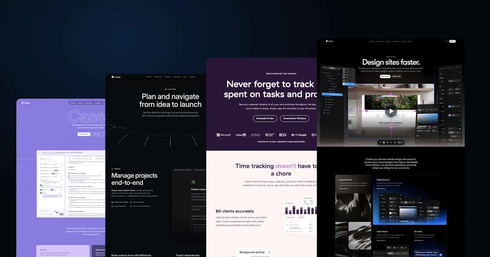
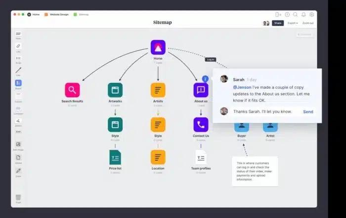
The Core Elements of a Perfect Website Navigation Bar
Understanding the anatomy of an effective navigation bar starts with identifying its essential components.
1. Logo Placement
Your logo should almost always appear in the top-left corner of the navigation bar. Users naturally expect this placement, and many instinctively click the logo to return to the homepage.
Best Practices
- Keep the logo clear and high-resolution
- Link it to the homepage
- Avoid oversized logos that dominate the navigation area
2. Primary Navigation Links
These are the most important pages on your website.

Common menu items include:
- Home
- About
- Services
- Products
- Blog
- Contact
Best Practices
- Limit menu items to 5–7 choices
- Use simple and familiar wording
- Prioritize the most valuable pages
Too many options can overwhelm users and increase decision fatigue.
3. Call-to-Action (CTA) Button
A high-performing navigation bar often includes a clear CTA button.
Examples:
- Get Started
- Book a Demo
- Contact Us
- Shop Now
Why It Matters
CTA buttons guide users toward conversion-focused actions and help businesses achieve specific goals.
Best Practices
- Use contrasting colors
- Make the button visually distinct
- Keep the text action-oriented
4. Search Functionality
For larger websites, a search bar is essential.
This is especially important for:
- eCommerce stores
- News websites
- Educational platforms
- Large blogs
Best Practices
- Use a recognizable search icon
- Place search in a visible location
- Include autocomplete when possible
5. Mobile Navigation Menu
With mobile traffic dominating the web, responsive navigation is no longer optional.
Most mobile websites use a hamburger menu icon to save screen space.
Best Practices
- Ensure menus are thumb-friendly
- Keep tap targets large enough
- Minimize scrolling within menus
- Test on multiple devices
6. Sticky Navigation
Sticky navigation remains visible as users scroll down the page.
Benefits
- Improves accessibility
- Encourages deeper browsing
- Keeps CTAs constantly visible
However, sticky menus should remain compact to avoid taking up excessive screen space.
Step-by-Step Guide to Creating the Perfect Website Navigation Bar
Now let’s build an optimized navigation system step by step.
Step 1: Understand Your Audience
Before designing anything, determine what users actually need.
Ask questions like:
- What pages are most important?
- What information do users search for most?
- What actions should users take?
Pro Tip
Use analytics tools such as heatmaps and behavior tracking to understand navigation patterns.
Step 2: Simplify Your Menu Structure
Complex menus often create friction.
Keep Navigation Simple
Instead of:
- Solutions
- Resources
- Capabilities
- Insights
Use:
- Services
- Blog
- Pricing
- Contact
Simple wording improves usability and clarity.
Step 3: Prioritize Important Pages
Not every page deserves equal attention.
Your most valuable pages should appear first in the navigation hierarchy.
Example for SaaS Websites
- Product
- Pricing
- Features
- Resources
- Contact
Example for eCommerce
- Shop
- Categories
- Deals
- About
- Support
Step 4: Design for Mobile First
Many designers still prioritize desktop layouts, but mobile-first navigation is now critical.
Mobile Navigation Tips
- Use collapsible menus
- Reduce unnecessary menu items
- Make navigation accessible with one hand
- Avoid tiny clickable areas
Responsive design directly impacts user satisfaction and SEO rankings.
Step 5: Use Visual Hierarchy
Visual hierarchy guides the eye naturally through the menu.
Effective Techniques
- Bold important links
- Highlight CTAs
- Use whitespace strategically
- Group related items logically
Good spacing improves readability and prevents clutter.
Step 6: Optimize Navigation for SEO
Website navigation also influences how search engines crawl your site.
SEO Best Practices
- Use descriptive anchor text
- Keep important pages within a few clicks
- Avoid duplicate navigation links
- Use internal linking strategically
Example
Instead of:
- “Click Here”
Use:
- “View Web Design Services”
Descriptive text improves both usability and search visibility.
Step 7: Test and Improve Continuously
Even excellent navigation can benefit from ongoing optimization.
What to Test
- Menu placement
- CTA wording
- Dropdown usability
- Mobile responsiveness
- Click-through rates
A/B testing can reveal valuable user preferences and behaviors.
Common Website Navigation Mistakes to Avoid
Even experienced designers make navigation mistakes that hurt usability.
Overloading the Menu
Too many links overwhelm users and reduce clarity.
Solution
Focus only on essential pages.
Using Confusing Labels
Creative wording may sound clever but often confuses visitors.
Avoid
- “Discoveries”
- “Knowledge Hub”
Prefer
- “Blog”
- “Resources”
Ignoring Mobile Users
Poor mobile navigation creates frustration and increases bounce rates.
Solution
Test your website on real mobile devices regularly.
Hiding Important Pages
Critical pages like pricing or contact information should never be difficult to find.
Solution
Keep high-value pages easily accessible.
Poor Dropdown Menus
Complicated dropdowns can become difficult to navigate.
Solution
Use clean, organized dropdown structures with logical categories.
Navigation Trends Shaping Modern Websites
Website navigation continues evolving with user behavior and technology.
Minimalist Navigation
Modern websites increasingly favor cleaner menus with fewer distractions.
Mega Menus
Large websites use mega menus to organize many categories visually.
These are especially common in:
- Online stores
- Universities
- News platforms
AI-Powered Navigation
Artificial intelligence now helps personalize navigation experiences based on user behavior.
Examples include:
- Personalized recommendations
- Dynamic menu ordering
- Smart search suggestions
Voice Navigation
As voice interfaces become more common, websites may eventually adapt navigation systems for conversational interactions.
How Great Navigation Impacts SEO
Search engines prioritize websites that provide excellent user experiences.
A strong navigation structure helps by:
- Improving crawlability
- Distributing link authority
- Reducing bounce rates
- Increasing time on site
Google values websites that make information easy to access.
Internal Linking Matters
Navigation bars create some of the most powerful internal links on your site.
Proper linking helps search engines understand:
- Content hierarchy
- Important pages
- Topic relevance
Examples of Excellent Website Navigation
Many successful brands demonstrate exceptional navigation design.
Characteristics of Great Navigation
- Clean layouts
- Clear labels
- Strong visual hierarchy
- Mobile responsiveness
- Fast accessibility
Industries such as SaaS, eCommerce, and media often lead innovation in navigation design.
Final Thoughts
The perfect website navigation bar combines simplicity, usability, responsiveness, and strategic design. It should help visitors move effortlessly through your site while supporting your business goals and SEO strategy.
Remember that navigation is not just a design element — it’s a user experience tool. Small improvements in menu structure can significantly impact engagement, conversions, and customer satisfaction.
As websites continue evolving, businesses that prioritize intuitive navigation will maintain a competitive advantage in both user experience and search rankings.
Investing time into creating a thoughtful navigation system is one of the smartest decisions you can make for your website.
Frequently Asked Questions (FAQs)
What is the ideal number of menu items in a navigation bar?
Most usability experts recommend keeping primary navigation between 5–7 items. Too many choices can overwhelm users and reduce clarity.
Should I use dropdown menus?
Dropdown menus work well when organizing large amounts of content. However, they should remain simple, intuitive, and easy to navigate.
Is sticky navigation good for SEO?
Sticky navigation itself does not directly improve SEO, but it can improve user experience, increase engagement, and reduce bounce rates, which may positively influence SEO performance.
What is the best navigation style for mobile websites?
Hamburger menus are commonly used for mobile navigation because they save screen space and keep layouts clean.
How often should I update my website navigation?
Review navigation regularly based on analytics and user behavior. Updating your menu every few months can help improve usability and adapt to changing business goals.
Can navigation affect website conversions?
Yes. Clear and intuitive navigation helps users find information faster and guides them toward actions like purchases, sign-ups, or inquiries.
What colors work best for navigation bars?
Neutral backgrounds with contrasting CTA buttons often perform best. Readability and accessibility should always take priority over aesthetics alone.