
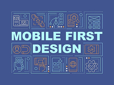
Step‑by‑Step Guide to Mobile‑First Design
1. Understand the Mobile-First Mindset
Begin by recognizing the unique constraints of mobile: limited screen space, touch navigation, and variable network speeds. Prioritize core features and content that must appear first—and leave extras for larger screens.
2. Start with Clean, Lean Content
Mobile-first design means stripping out the non-essential and focusing on what truly matters—your message. A content-first strategy ensures clarity and usability.
3. Implement Responsive Layouts Using Progressive Enhancement
Use CSS media queries to scale up from the smallest screens:
-
~480px: Single-column layout, collapsible navigation
-
~768px: Two columns or expanded menu
-
1024px+: Multi-column, full navigation bar
-
1280px+: Rich layout with sidebars or broader content areas
Ensure you include<meta name="viewport" content="width=device-width, initial-scale=1">for accurate scaling.
4. Prioritize Performance
Optimizing for speed is non-negotiable. Compress images (WebP/AVIF), minify CSS/JavaScript, defer non-critical scripts, and use CDNs and caching. Fast load times reduce bounce rates and improve both UX and SEO.
5. Design for Touch and Thumb Interaction
Touchable targets should be around 44–48 pixels with sufficient spacing to avoid accidental taps. Plus, keep text at 16px or above for readability.
6. Integrate Mobile‑Specific Features
Leverage device capabilities—GPS for store locators, click‑to‑call buttons, touch gestures (like swipes), or even camera access. These enhance functionality in meaningful ways.
7. Ensure Accessibility from the Ground Up
Follow WCAG guidelines: use semantic HTML, alt-text for images, proper contrast, logical reading order, and navigable structure—making your site usable for everyone, everywhere.
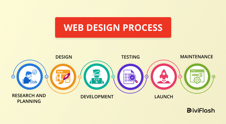
8. Test, Iterate, and Optimize Engagement
Continuous testing is critical: perform usability checks across devices, gather feedback, and refine. Use A/B testing and analytics to iterate on navigation, layouts, and CTAs for better engagement.
9. Avoid Mobile Design Pitfalls
Don’t fall into desktop habits—like loading heavy spinners or complex navigation. Instead, use skeleton screens or assume actions (optimistic UI) to keep things feeling fast and fluid.
10. Stay Ahead with Evolving Standards
Mobile design continues to evolve. Keep an eye on new interface patterns, accessibility tools, performance metrics, and SEO best practices. Staying current keeps your experience fresh and competitive.
FAQs
Q1: What’s the difference between “mobile‑first” and “responsive” design?
Mobile-first starts with designing for the smallest screens and scales upward, while responsive design is about making layouts adjust fluidly across screen sizes. Mobile-first is often built using responsive techniques—mobile-first is the design philosophy, responsive is the toolset.
Q2: Why can’t we just adapt a desktop design to mobile?”
That desktop-first approach—known as graceful degradation—often leads to cluttered mobile experiences. Mobile-first ensures you’re focusing on essentials and performance right from the start.
Q3: How much of a performance impact does mobile-first make?
Mobile-first websites that optimize for speed see lower bounce rates—users are more likely to stay, and Google rewards fast, mobile-ready sites with better search rankings.
Q4: Is mobile-first really necessary in 2025?
Absolutely. Google now uses mobile-first indexing for new websites, and the majority of traffic comes from mobile. A poor mobile experience can harm both SEO and user trust.
Q5: How do I design touch-friendly navigation?
Make buttons and touch targets large enough (≥44px), spaced well, and consider gesture-friendly interactions (like swipes) to improve usability.
Conclusion
Designing for mobile-first means respecting your users—where they are, how they interact, and what they expect. From content hierarchy and touch-friendly layouts to performance and accessibility, every design decision matters. By starting small and thinking big, you’re creating a site that not only looks great across devices but also performs well, ranks better in search, and delivers an experience people love.