
How Font Sizes Reflect the Future of Minimalist Web Design
Introduction: The New Minimalism Is Bold — and Bigger
Minimalist web design has evolved far beyond empty white spaces and subtle grays. The new minimalism is intentional. It’s about clarity, hierarchy, and visual breathing room — and one of the biggest drivers of this shift is font size.
Typography has become the heartbeat of modern web design. In fact, larger font sizes are shaping how users perceive simplicity, usability, and even brand personality online. A few years ago, a 14px paragraph might have been the norm; today, 18px to 20px is standard. Why? Because users expect instant legibility and effortless interaction across every screen size.
In this guide, we’ll explore how font sizes are redefining minimalist design, why it matters for the future of the web, and how you can apply these principles to your own site — step by step.
Why Font Size Matters in Minimalist Design
Minimalism isn’t just about reducing clutter; it’s about emphasizing what truly matters. Font size plays a direct role in this because it controls how users consume content.
Think of font size as a hierarchy tool. A well-scaled type system naturally guides the eye from headline to paragraph, creating a seamless reading flow without unnecessary design elements. When done right, larger, more readable text is the design.
The Psychology Behind Bigger Fonts
-
Trust and confidence: Larger fonts make content appear more open and approachable, while small text can seem dated or cramped.
-
Focus and simplicity: Bigger text reduces cognitive load. Users can absorb content faster without distraction.
-
Accessibility and inclusivity: Readability is essential for everyone — not just for users with perfect vision.
Minimalism and accessibility now go hand in hand, and both depend on how designers use font sizes intelligently.
The Evolution of Font Sizes in Web Design
To understand where we’re going, let’s look at where we’ve been.
-
Early 2000s: Small text dominated (think 12px to 14px). Web designers prioritized fitting content over readability.
-
2010s: Responsive design emerged. Font sizes started scaling with devices, but many sites still favored compact layouts.
-
2020s and beyond: Accessibility and UX took center stage. Designers began embracing whitespace, larger text, and modular grids.
Now, minimalist websites often feature 32px+ headlines and 18–20px body text — a clear shift toward clarity and confidence.
The message is simple: less clutter, more emphasis. Font sizes aren’t just functional; they’re a design statement.
Step-by-Step Guide: Designing a Minimalist Website with Perfect Font Sizes
Ready to create a minimalist, future-proof design that uses typography as its foundation? Here’s a step-by-step approach.
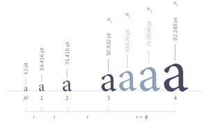
Step 1: Define Your Typographic Scale
Start with a modular scale — a mathematical system that maintains proportional relationships between font sizes.
Common ratios include:
-
1.25 (Major Third): Balanced and versatile
-
1.333 (Perfect Fourth): Great for editorial-style designs
-
1.5 (Perfect Fifth): Ideal for bold, minimalist layouts
For example:
-
Base font: 18px
-
H6: 22px
-
H5: 27px
-
H4: 36px
-
H3: 48px
-
H2: 64px
-
H1: 96px
This hierarchy ensures every heading feels intentional and visually connected.
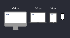
Step 2: Prioritize Readability Across Devices
Minimalist design shines when it’s fluid. That means your font sizes should scale seamlessly on any screen.
Step 3: Embrace White Space as a Design Element
Minimalist design isn’t just about what’s visible — it’s also about what’s not. Large font sizes work best when paired with ample white space.
Spacing creates rhythm and focus. Try:
-
Line height: 1.5–1.8 for paragraphs
-
Letter spacing: Slightly increased for uppercase headings
-
Margins: Double the line height between text blocks
The goal? Let your typography breathe. White space amplifies the elegance of large text and reinforces minimalism.
Step 4: Choose Fonts That Align with Minimalism
Typography is personality. Choose clean, versatile typefaces that complement simplicity rather than compete with it.
Popular minimalist fonts include:
-
Sans-serif: Inter, Helvetica Neue, Open Sans, Lato, Poppins
-
Serif: Playfair Display, Merriweather, Libre Baskerville
-
Variable fonts: Roboto Flex, Inter Variable — great for responsive scaling
Stick to two typefaces maximum — one for headings, one for body — to maintain consistency and reduce visual noise.
Step 5: Contrast and Color — Less Is More
Font size alone doesn’t create emphasis; contrast does.
In minimalist design, color contrast must enhance legibility without overwhelming the aesthetic.
Best practices:
-
Dark gray text on white backgrounds feels softer than pure black.
-
For dark mode, use off-white text to reduce eye strain.
-
Limit color accents to links or call-to-actions (CTAs).
The combination of larger font sizes and subtle contrast ensures focus where it matters most — the content.
Step 6: Test for Accessibility and Real-World Use
Accessibility should drive your design decisions. The Web Content Accessibility Guidelines (WCAG) recommend:
-
Minimum body text: 16px
-
High contrast ratio: 4.5:1 or higher for normal text
Test your design with tools like:
-
WebAIM Contrast Checker
-
Google Lighthouse
-
Chrome DevTools Device Emulator
Remember: minimalist design isn’t just for aesthetics — it’s for everyone.
How Font Sizes Shape the Future of Minimalist Web Design
The future of web design is not about how much you can remove — it’s about how clearly you can communicate. And font size is at the heart of that evolution.
1. Accessibility as a Core Design Principle
Modern users expect inclusivity by default. Larger, readable text ensures that minimalist sites remain functional, not just beautiful.
2. Typography-First Branding
Brands are using typography as their logo, identity, and voice. Larger, expressive fonts define tone without relying on heavy graphics.
3. Performance Optimization
Big, clean typography loads faster than images or icons — making minimalist sites faster and lighter.
4. Cross-Device Consistency
As screens diversify (phones, tablets, VR, wearables), scalable font systems ensure legibility everywhere. The minimalist aesthetic adapts seamlessly.
5. Emotional Simplicity
Large type creates calm. It tells users, “Relax — you don’t have to work to read this.” That emotional simplicity defines the modern web experience.
Common Mistakes to Avoid
Even with the best intentions, minimalist typography can go wrong. Watch out for:
-
Overly small text: Anything under 16px is hard to read.
-
Too many font weights: Stick to 2–3 weights (regular, medium, bold).
-
Poor line height: Tight spacing makes even big text feel crowded.
-
Ignoring hierarchy: If all text is large, nothing stands out.
Consistency, not complexity, drives successful minimalist design.
FAQs About Font Sizes and Minimalist Design
1. What’s the best body font size for a minimalist website?
Generally, 18px to 20px works best for readability on modern screens. It feels open, accessible, and professional.
2. How large should headings be compared to body text?
Aim for a 1.5× to 2.5× ratio. For instance, if your body text is 18px, your H1 could range from 36px to 45px depending on design balance.
3. Do large fonts slow down websites?
No — in fact, they often improve performance by reducing reliance on heavy visuals. Text renders faster than images.
4. How does font size impact SEO?
Readable, well-structured typography improves user engagement and dwell time, two factors that indirectly support SEO. Search engines also value accessible, user-friendly designs.
5. Can minimalist design still be creative?
Absolutely. Minimalism isn’t about limitation — it’s about intention. Through thoughtful use of font size, spacing, and contrast, you can craft bold, creative experiences that feel effortless.
Conclusion: Big Fonts, Big Future
As web design continues to evolve, font size has become the new visual language of minimalism. It’s how brands communicate confidence, accessibility, and focus without relying on excessive visuals.
The future belongs to designs that speak clearly — where typography leads the experience, and every pixel has purpose.
So the next time you build or redesign a website, remember: minimalism doesn’t mean small. It means smart, spacious, and beautifully legible. And the right font size is where it all begins.