How to Design a Clean and User-Friendly Contact Form
A well-designed contact form can be the bridge between your website and your visitors. Whether you’re running a small business, a portfolio site, or an eCommerce store, your contact form is one of the most essential tools for communication. But not all contact forms are created equal. A cluttered, confusing, or overly long form can frustrate users and hurt conversions.
In this guide, we’ll show you how to design a clean and user-friendly contact form that not only looks great but also encourages more people to reach out. We’ll cover practical design tips, usability best practices, and implementation steps — all without overwhelming you with technical jargon.
Why a Clean and User-Friendly Contact Form Matters
Your contact form serves as the gateway for inquiries, feedback, and opportunities. When it’s thoughtfully designed, it can:
-
Improve trust and credibility
-
Encourage higher engagement
-
Reduce bounce rates
-
Increase lead generation
On the other hand, a poorly designed form can lead to confusion, form abandonment, or worse—no submissions at all.
So let’s dive into how you can design a form that’s simple, effective, and user-friendly.
Step-by-Step Guide: How to Design a Clean and User-Friendly Contact Form
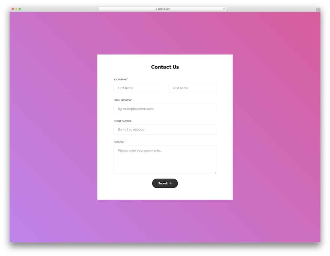
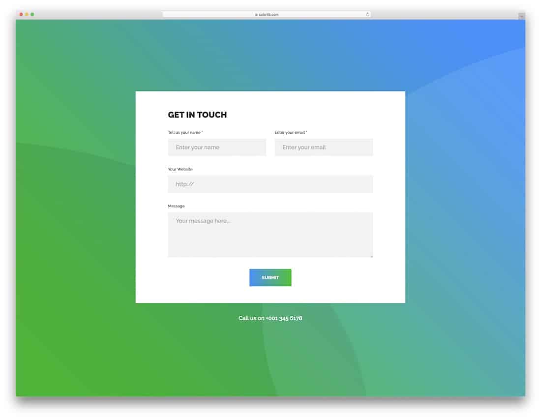
1. Keep the Form Short and Focused
Less is more. Only ask for the information you really need. Long forms with too many fields tend to scare users away.
Recommended Fields:
-
Name
-
Email address
-
Message
Optional (if relevant):
-
Subject
-
Phone number (only if needed)
Pro Tip: If you’re unsure whether a field is necessary, it probably isn’t.
2. Use Clear Labels and Field Titles
Each field should have a clear, concise label. Avoid placeholder-only text, as it disappears when users start typing. Clear labels make your form more accessible, especially for users relying on screen readers.
3. Group Related Fields Logically
Organize your form in a way that feels natural. Group related fields together, and follow a vertical layout. Most users expect to read from top to bottom—not side to side.
Example:
-
Contact details first (name, email)
-
Then message or inquiry
-
Finally, optional fields or checkboxes
Avoid splitting the form into multiple columns unless necessary.
4. Make the Submit Button Stand Out
Your call to action (CTA) should be clear and visible. Use a contrasting color that aligns with your website’s design but still stands out on the page.
Text ideas for the button:
-
“Send Message”
-
“Get in Touch”
-
“Submit”
Avoid generic text like “Click Here” — it’s vague and uninviting.
5. Add Real-Time Validation
Validation helps users avoid errors before they submit the form. If someone forgets to fill in a required field or types an invalid email, gently guide them with inline messages.
Good validation:
-
“Please enter a valid email address.”
-
“Name cannot be empty.”
Avoid aggressive or red-text warnings unless necessary. Keep it friendly.
6. Ensure Mobile Responsiveness
With over half of web traffic coming from mobile devices, your contact form must work well on all screen sizes. A clean, responsive design ensures your form doesn’t break or become unreadable on phones or tablets.
Mobile-friendly tips:
-
Use large, touch-friendly input fields
-
Avoid multi-column layouts
-
Test your form on different devices
7. Use Smart Defaults and Autofill
Where possible, use browser-supported autofill features and sensible default options (e.g., pre-selecting a country or inquiry topic if applicable). This saves users time and reduces friction.
8. Include a Success Message or Confirmation
Once someone hits “Submit,” don’t leave them wondering if their message went through. Show a clear confirmation message like:
“Thanks for reaching out! We’ll get back to you within 24 hours.”
You can also send an automatic confirmation email if your system supports it.
9. Avoid Captchas When Possible
While spam protection is important, overly complex CAPTCHAs can hurt the user experience. Use simpler alternatives like:
-
Honeypot fields (hidden fields bots fill but users don’t)
-
Google’s reCAPTCHA v3 (invisible to users)
-
Backend filtering for spammy submissions
Only use traditional image CAPTCHAs as a last resort.
10. Match the Form Design to Your Site’s Aesthetic
Your contact form should feel like part of your website, not an afterthought. Use matching fonts, colors, and spacing to maintain a consistent look and feel.
Design cohesion builds trust and encourages users to engage.
Bonus: Tools to Help You Build a Clean Contact Form
Not a developer? No problem. Here are some tools that can help:
-
Typeform – Great for conversational forms
-
WPForms (WordPress) – Easy drag-and-drop builder
-
Google Forms – Simple and free option
-
Formspree / Getform – For static HTML sites
-
Jotform – Flexible and beginner-friendly
These tools offer pre-made templates and user-friendly interfaces to get you started fast.
FAQs: Clean and User-Friendly Contact Forms
1. How many fields should my contact form have?
As few as possible. Ideally, stick to 3–5 fields. Every additional field reduces the chance of submission.
2. Should I use a dropdown or radio buttons for “Reason for Contact”?
If there are only a few clear options (e.g., 3–5), use radio buttons. If the list is long, go with a dropdown to save space.
3. What’s the best position for the contact form on my website?
Place it on a dedicated Contact Us page, and consider adding a mini version in the footer or sidebar. Keep it easily accessible.
4. Do I need to include a phone number field?
Only if it’s essential. Many users are hesitant to share phone numbers, especially for general inquiries.
5. How can I prevent spam without hurting UX?
Use invisible CAPTCHA solutions (like reCAPTCHA v3), honeypot fields, or email verification. Avoid intrusive security measures.
6. Should I include a privacy notice or disclaimer?
Yes — especially if you collect sensitive information. A short line like “We respect your privacy. Your information won’t be shared.” can go a long way in building trust.
Final Thoughts: Simplicity Wins Every Time
Designing a contact form might seem like a small detail, but it plays a huge role in your site’s usability and conversion rate. By focusing on clarity, responsiveness, and user experience, you can create a form that feels effortless to fill out.
Now that you know how to design a clean and user-friendly contact form, it’s time to put these tips into action. Whether you’re coding from scratch or using a form builder, remember: the best form is the one that gets used.