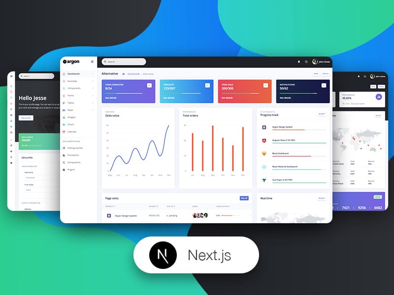
How to Read Your Website Dashboard Like a Pro
If you’ve ever opened your website dashboard and felt overwhelmed by charts, graphs, and numbers—you’re not alone. Dashboards are packed with valuable insights, but without knowing what to look for, they can feel more confusing than helpful.
The truth is, your website dashboard is one of the most powerful tools you have. It tells you how visitors find your site, what they do when they arrive, and where you might be losing opportunities. Once you understand how to interpret this data, you can make smarter decisions, improve performance, and ultimately grow your online presence.
In this guide, you’ll learn how to read your website dashboard like a pro, step by step—without getting lost in jargon or unnecessary complexity.
Why Your Website Dashboard Matters
Before diving into the “how,” it’s important to understand the “why.”
Your dashboard isn’t just a collection of numbers—it’s a real-time snapshot of your website’s health and performance. It helps you:
- Track traffic and user behavior
- Measure marketing effectiveness
- Identify technical or UX issues
- Discover growth opportunities
- Make data-driven decisions
Think of it as your website’s control panel. When you know how to read it properly, you’re no longer guessing—you’re strategizing.
Step-by-Step: How to Read Your Website Dashboard Like a Pro
1. Start With Your Goals
Before looking at any data, ask yourself: What am I trying to achieve?
Your interpretation of the dashboard depends on your goals. For example:
- Blog or content site: Focus on page views, time on page, and traffic sources
- Ecommerce store: Look at conversions, revenue, and cart abandonment
- Service-based business: Track leads, form submissions, and user journeys
When you align your dashboard reading with your goals, the data becomes meaningful instead of overwhelming.
2. Understand Your Key Metrics
Not all metrics are created equal. Here are the core ones you should know:
Traffic (Users & Sessions)
This shows how many people visit your site and how often.
- Users: Individual visitors
- Sessions: Total visits (one user can have multiple sessions)
👉 Pro tip: A growing number of users usually indicates successful marketing or SEO efforts.
Traffic Sources
This tells you where your visitors are coming from:
- Organic search (Google, Bing)
- Direct (typing your URL)
- Referral (other websites)
- Social media
- Paid ads
👉 Pro tip: If organic traffic is growing, your SEO strategy is working.

Bounce Rate
Bounce rate measures the percentage of visitors who leave after viewing only one page.
- High bounce rate = users didn’t find what they expected
- Low bounce rate = users are exploring your site
👉 Context matters: A high bounce rate isn’t always bad (e.g., blog posts that fully answer a question).
Average Session Duration
This shows how long users stay on your site.
- Longer time = more engagement
- Short time = possible content or UX issues
Conversion Rate
This is one of the most important metrics.
It measures how many visitors complete a desired action, such as:
- Making a purchase
- Signing up for a newsletter
- Filling out a contact form
👉 Pro tip: Even small improvements in conversion rate can significantly increase revenue.
3. Analyze User Behavior
Once you understand the basics, dig deeper into how people interact with your site.
Popular Pages
Identify which pages get the most traffic.
Ask yourself:
- Why are these pages performing well?
- Can I replicate this success elsewhere?
Exit Pages
These show where users leave your site.
- Are users dropping off on important pages?
- Is there a technical issue or unclear call-to-action?
User Flow
This visual map shows how users move through your site.

👉 Pro insight: If users aren’t following your intended path (e.g., landing → product → checkout), you may need to simplify navigation.
4. Segment Your Data
Professionals don’t just look at overall numbers—they break them down.
You can segment by:
- Device (desktop vs mobile)
- Location
- Traffic source
- New vs returning users
Why this matters:
A dashboard might look fine overall, but segmentation can reveal hidden issues.
Example:
- Desktop conversion rate: 5%
- Mobile conversion rate: 1%
👉 This signals a mobile usability problem.
5. Look for Trends, Not Just Numbers
A single data point doesn’t tell the full story. Instead, focus on trends over time.
Ask:
- Is traffic increasing or decreasing?
- Are conversions improving?
- Did a recent change impact performance?
Compare:
- Week over week
- Month over month
- Year over year
👉 Pro tip: Trends help you make informed decisions instead of reacting emotionally to short-term fluctuations.
6. Connect Data to Action
Reading your dashboard is only valuable if it leads to action.
Here’s how to turn insights into improvements:
- High traffic, low conversions: Improve calls-to-action or landing pages
- High bounce rate: Optimize content relevance or page speed
- Low engagement: Add visuals, videos, or clearer structure
- Traffic drop: Review SEO, technical issues, or recent updates
Always ask: What does this data suggest I should do next?
7. Use Benchmarks (But Don’t Obsess Over Them)
It’s helpful to compare your metrics against industry averages, but don’t rely on them too heavily.
Every website is different. Instead:
- Compare your current performance to your past performance
- Focus on continuous improvement
8. Create a Simple Dashboard Routine
Consistency is key to mastering your dashboard.
Daily (quick check)
- Traffic spikes or drops
- Real-time activity
Weekly
- Traffic sources
- Top-performing pages
- Conversions
Monthly
- Overall growth trends
- Campaign performance
- Strategic adjustments
👉 Pro tip: Don’t check obsessively—focus on meaningful patterns.
Common Mistakes to Avoid
Even experienced users can misinterpret dashboard data. Here are a few pitfalls to watch out for:
- Focusing on vanity metrics: High traffic means nothing without conversions
- Ignoring context: Numbers need interpretation
- Overreacting to short-term changes: Look at trends instead
- Not setting clear goals: Data without direction is useless
- Trying to track everything: Focus on what matters most
Tools That Power Website Dashboards
Most dashboards come from analytics tools. Some popular ones include:
- Google Analytics
- Search Console
- CMS dashboards (like WordPress)
- Ecommerce platforms (like Shopify)
Each tool presents data differently, but the core principles remain the same.
FAQs: How to Read Your Website Dashboard Like a Pro
1. What is the most important metric in a website dashboard?
There isn’t a single “most important” metric—it depends on your goals. However, conversion rate is often the most valuable because it directly reflects business results.
2. How often should I check my website dashboard?
A quick daily check is fine, but deeper analysis should be done weekly or monthly. This helps you focus on trends rather than short-term fluctuations.
3. Why is my website getting traffic but no conversions?
This usually means there’s a mismatch between user expectations and your offer. Common causes include:
- Weak call-to-action
- Poor landing page design
- Slow load times
- Irrelevant traffic sources
4. What does a high bounce rate mean?
A high bounce rate can indicate:
- Poor user experience
- Slow loading pages
- Content not matching user intent
However, it’s not always negative—some pages naturally have higher bounce rates.
5. How can I improve my dashboard insights?
To get more value from your dashboard:
- Set clear goals
- Use segmentation
- Track conversions properly
- Regularly review trends
- Take action based on data
Final Thoughts
Learning how to read your website dashboard like a pro isn’t about memorizing every metric—it’s about understanding what matters and using that knowledge to make better decisions.
Start simple. Focus on your goals. Pay attention to trends. And most importantly, act on what you learn.
Over time, your dashboard will transform from a confusing set of numbers into a powerful tool for growth.