Mastering the Art of Bold Colors in Website Design
In the ever-evolving world of website design, color plays a significant role in creating visually appealing, user-friendly, and impactful experiences. One trend that has gained substantial traction is the use of bold, vibrant colors. When used correctly, bold colors can draw attention, evoke emotions, and set the tone of your website. However, implementing bold colors requires careful thought and strategy to ensure it enhances rather than detracts from the overall design.
In this article, we will explore the importance of bold colors in website design, the psychology behind color choices, tips for mastering bold color palettes, and common mistakes to avoid. Let’s dive into the world of color and learn how to use it to its fullest potential.
Why Bold Colors Matter in Website Design
Bold colors can make a lasting impression on visitors. When you use vibrant and daring hues, you immediately catch the eye and create an engaging user experience. Colors have a powerful influence on a visitor’s emotions, behavior, and perception of a brand. The use of bold colors can amplify your website’s message and make it stand out from the sea of more subdued or neutral designs.

The Psychological Impact of Colors
Colors have psychological effects that can significantly influence how users perceive your website. Each color carries different meanings and evokes various emotional responses. For example:
Red can convey excitement, passion, and urgency, which is why it’s often used in call-to-action buttons or to grab attention.
Blue communicates trust, calm, and professionalism, making it an excellent choice for corporate websites.
Yellow is associated with positivity, energy, and creativity, which can create an inviting atmosphere for your site.
Green often represents growth, health, and sustainability, making it a popular choice for eco-conscious brands.
Purple symbolizes luxury, creativity, and sophistication, giving your website an air of elegance.
By strategically selecting bold colors based on the psychological impact of each hue, you can guide visitors’ emotions and actions as they interact with your website.
Tips for Using Bold Colors Effectively
While bold colors can be captivating, they must be used thoughtfully to avoid overwhelming your audience. Here are some key strategies for using bold colors effectively in website design:
1. Limit the Number of Bold Colors
When using bold colors, less is often more. Too many bold colors can cause visual chaos, making it hard for users to focus on the most important elements of your site. Instead, select two or three bold hues and pair them with neutral tones to balance the design. This approach allows your bold colors to pop without overwhelming the user.
For example, you might use a vibrant orange for buttons or key sections of the page while pairing it with white or gray backgrounds to create a clean, focused look.
2. Use Contrast Wisely
Contrast is one of the most effective ways to create a visually striking design. Bold colors paired with contrasting elements, such as text or background color, draw attention and improve readability. For example, placing white text on a dark background or using complementary color pairings (like purple and yellow) can make your content stand out more clearly.
It’s essential to maintain sufficient contrast to ensure that all text is legible. Web accessibility guidelines recommend a contrast ratio of at least 4.5:1 for normal text and 3:1 for large text to ensure that users with visual impairments can navigate your site comfortably.
3. Focus on the Call-to-Action (CTA)
Bold colors are perfect for highlighting call-to-action buttons or links. A well-placed, attention-grabbing button can drive user interaction and improve conversions. Whether you want visitors to sign up for a newsletter, make a purchase, or explore more of your content, a bold color that stands out on the page can prompt immediate action.
For example, using a bright red or green button against a white or neutral background helps the CTA to stand out without distracting from the rest of the page.
4. Align Colors with Branding
One of the most critical aspects of any website design is brand consistency. Bold colors should align with your brand identity and communicate your brand values. For example, if your brand is known for being playful and energetic, bold and vibrant colors like orange, pink, and turquoise may fit well. On the other hand, a luxury brand might lean toward deeper tones like gold, navy blue, or burgundy to convey sophistication.
Always ensure that your color choices reflect the personality and ethos of your brand. This alignment strengthens your brand recognition and fosters trust with your audience.
5. Consider Color Accessibility
Inclusivity in design is essential, and color accessibility should not be overlooked. Approximately 1 in 12 men and 1 in 200 women have some form of color blindness, so it’s essential to choose color palettes that are distinguishable for all users. Ensure that color combinations are distinguishable even to those with color vision deficiencies by utilizing color contrast tools and ensuring that important information isn’t conveyed solely through color.
Additionally, provide alternative text and symbols for important visual cues. This way, even if users cannot perceive a particular color, they can still understand the content on your website.
Common Mistakes to Avoid When Using Bold Colors
While bold colors can elevate your website’s design, there are a few common mistakes that can detract from the user experience. Here are some pitfalls to avoid when working with bold colors:
1. Overuse of Bright Colors
Using too many bright, bold colors can make your website feel overwhelming. If every element on your site is competing for attention, it can create a jarring experience for your users. Instead, try focusing on key areas that need attention, such as buttons, banners, or important headings.
Keep the background or primary sections of your website in more neutral tones, allowing the bold colors to accentuate the key components.
2. Ignoring Color Harmony
Color harmony is essential to a cohesive design. If you choose bold colors without considering how they interact, the design can feel disjointed. Use tools like Adobe Color or Coolors to help you select complementary or analogous color schemes that create a visually pleasing experience.
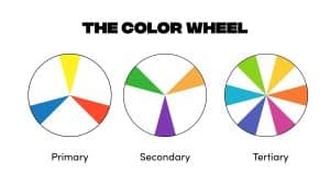
You can also use color theory to inform your decisions—using analogous colors (next to each other on the color wheel) for a harmonious look or complementary colors (opposite each other on the color wheel) for contrast and vibrancy.
3. Forgetting Mobile Responsiveness
Bold colors should also be considered in the context of mobile responsiveness. Mobile devices have smaller screens, and bright colors can look different when scaled down. Be sure to test your design on various devices to ensure that your bold colors still deliver the desired impact without looking too overpowering or distracting.
Conclusion
Mastering the art of bold colors in website design is about balancing creativity with functionality. When done right, bold colors can create a memorable and visually appealing user experience that reflects your brand identity, evokes emotions, and improves user engagement.
By focusing on contrast, limiting the number of bold colors, and aligning your choices with your brand’s message, you can use color to enhance your website’s overall design and usability. However, remember that moderation and thoughtful application are key—bold colors should enhance, not overwhelm, your website’s content.