
The Rise of Touch-Friendly Web Elements in Modern Design
As digital interfaces continue to evolve, touch interactions have become a central part of how users engage with websites and applications. The increasing prevalence of mobile devices, tablets, and hybrid laptops has created a demand for web elements that are not only functional but also intuitive and easy to use with touch. This article explores the rise of touch-friendly web elements in modern design, their importance, design principles, and best practices to enhance usability and accessibility.

Understanding Touch-Friendly Design
What Are Touch-Friendly Web Elements?
Touch-friendly web elements refer to interface components—such as buttons, links, menus, and form fields—that are optimized for touch-based interaction rather than traditional mouse-and-keyboard input. These elements are designed to accommodate finger taps, swipes, and gestures, ensuring that users can navigate and interact with content comfortably and accurately.
Why It Matters
With over half of global web traffic now coming from mobile devices, creating touch-friendly experiences is no longer optional—it’s essential. A poor touch interface can lead to user frustration, increased bounce rates, and lost conversions. On the other hand, intuitive and well-designed touch interfaces enhance user satisfaction and engagement.
Key Principles of Touch-Friendly Design
1. Appropriate Target Size
The average adult finger pad is around 10mm wide, which means touch targets (like buttons and links) should be at least 44×44 pixels, as recommended by Apple’s Human Interface Guidelines. Adequate size ensures users don’t accidentally tap the wrong element, especially on smaller screens.
2. Sufficient Spacing
Closely spaced elements increase the likelihood of mis-taps. Designers should provide enough padding and margin between interactive components to reduce errors and improve the overall usability of the interface.
3. Visual Feedback
Users need confirmation that their actions have been registered. Adding hover effects for desktops and press states for touch devices gives immediate feedback and builds confidence in the interaction.
4. Simplified Navigation
Complex menus and interactions can be frustrating on touch devices. Streamlined, collapsible menus (like hamburger menus) and clear visual hierarchies help users find what they need without excessive tapping or scrolling.
Common Touch-Friendly Elements in Modern Web Design
Touchable Buttons
Buttons are one of the most fundamental elements in UI design. In touch-friendly layouts, buttons often have large, bold typography, generous padding, and strong contrast to make them easily tappable and visible under various lighting conditions.
Swipeable Carousels and Sliders
Instead of relying solely on arrows or click-based navigation, modern carousels allow users to swipe through content. This is particularly effective for showcasing products, testimonials, or portfolios in a visually appealing, interactive way.
Gesture-Based Controls
Gestures such as pinch-to-zoom, pull-to-refresh, or swipe-to-delete have become intuitive actions thanks to mobile operating systems. Web designers are increasingly integrating gesture support to match native app experiences.
Expandable Menus and Accordions
On smaller screens, expandable menus and accordion interfaces allow designers to organize content without overwhelming the user. These elements collapse and expand with a single tap, making them ideal for FAQs, navigation panels, or settings menus.
Frameworks and Tools Supporting Touch Design
Responsive Frameworks
CSS frameworks like Bootstrap and Foundation offer built-in classes that support responsive and touch-friendly layouts. These tools allow designers to create fluid grids and adaptive elements that look great on any screen size.
Touch Libraries and Plugins
JavaScript libraries such as Hammer.js or interact.js provide robust APIs for detecting and managing touch gestures. These tools simplify the implementation of complex touch interactions without writing custom code from scratch.
Progressive Enhancement
Modern web development often follows the principle of progressive enhancement—ensuring basic content and functionality are available to all users, while more advanced features enhance the experience on capable devices. Touch support should be layered thoughtfully into this strategy.
Best Practices for Implementing Touch-Friendly Web Elements
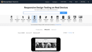
1. Test on Real Devices
Emulators can help during development, but real-world testing on a range of physical devices ensures that your touch elements perform as expected under varied conditions, including screen sizes, orientations, and hardware capabilities.
2. Design for Accessibility
Touch-friendly doesn’t just mean large and clickable—it also means inclusive. Ensure elements meet WCAG accessibility standards, support screen readers, and maintain high contrast ratios for users with visual impairments.
3. Avoid Hover-Only Interactions
Touch devices don’t support hover states in the traditional sense. Designers should avoid relying on hover to reveal critical navigation or features. If hover is used, ensure an alternative touch-friendly method is also available.
4. Keep Content Prioritized
Cluttered screens are hard to navigate with touch. Prioritize core content and actions, use progressive disclosure for secondary features, and always ensure a clear path for user interaction.
The Future of Touch Interaction
Beyond Mobile Devices
Touch interfaces are no longer limited to smartphones and tablets. From touch-enabled desktops and in-car dashboards to interactive kiosks and smart appliances, touch-friendly design must now cater to a diverse ecosystem of devices.
Touch + Voice + Gesture Integration
The next frontier in UI design involves multi-modal interaction. Designers are beginning to explore how touch can be combined with voice commands, eye tracking, and gesture controls to create seamless, intuitive experiences across platforms.
Personalized UX
With advances in AI and user analytics, touch interactions can be tailored to individual user behaviors. Adaptive interfaces that respond to touch patterns and preferences could redefine personalization in web experiences.
Conclusion
The rise of touch-friendly web elements represents a pivotal shift in how designers approach digital interfaces. As touch becomes the primary input method for billions of users, crafting accessible, responsive, and intuitive interactions is more critical than ever. By embracing best practices, leveraging the right tools, and staying ahead of emerging trends, designers can ensure their work remains functional and user-friendly in an increasingly touch-driven world.