Why Glassmorphism Isn’t Dead Yet – 2025 Update
In the fast-paced world of web and UI design, trends come and go like seasonal fashion. One year it’s all about flat design, the next it’s brutalism or skeuomorphism. But there’s one visual style that continues to surprise us with its longevity and adaptability: Glassmorphism.
If you thought this semi-transparent, frosted-glass aesthetic had seen its final days, think again. In this 2025 update, we’ll explore why glassmorphism isn’t dead yet, how it’s evolving, and why it’s still a go-to for designers who want to add a modern, sleek feel to their projects.
🔍 What Is Glassmorphism?
Glassmorphism is a UI design trend characterized by:
-
Frosted-glass appearance
-
Semi-transparent layers
-
Blurred backgrounds
-
Subtle shadows and borders
-
Light or pastel color schemes
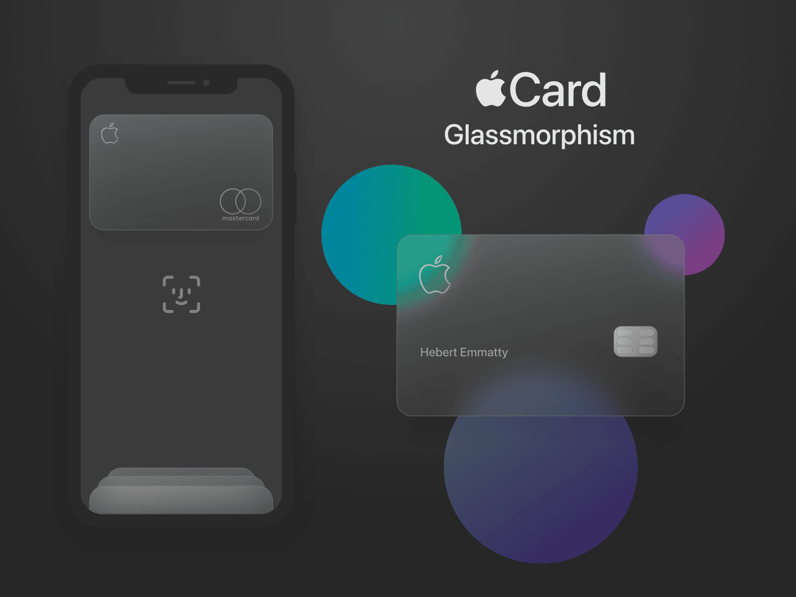
It gained momentum around 2020–2021, popularized by Apple’s macOS Big Sur and Microsoft’s Fluent Design System. At its core, glassmorphism mimics the look of translucent glass panels layered over colorful or dynamic backgrounds.
✨ Why Glassmorphism Isn’t Dead in 2025
1. Adaptability Across Devices and Platforms
Glassmorphism has matured beyond gimmicky transparency effects. It now adapts well to both mobile and desktop interfaces, ensuring good readability and contrast. Thanks to evolving CSS and GPU rendering, the effect is smoother and more performant than ever.
2. UI Libraries and Framework Support
Modern UI libraries like Tailwind CSS, Bootstrap 5, and React UI kits have built-in support or plugins that make implementing glassmorphism easy and lightweight. What used to be a challenge for performance or accessibility is now a breeze with tools and templates.
3. AI and Motion Integration
Designers are combining glassmorphism with AI-generated motion effects, microinteractions, and dynamic backgrounds. This elevates the aesthetic from static transparency to an immersive, responsive experience.
4. Demand for Modern, Elegant Interfaces
As digital products fight for user attention, sleek, polished interfaces can make or break first impressions. Glassmorphism communicates modernity, clarity, and depth—qualities brands love in 2025.
5. Used Strategically, Not Excessively
The reason some thought glassmorphism was “dead” is because it was overused. But in 2025, designers are more restrained and strategic. It’s not about using glassmorphism everywhere—just in the right places: login forms, card layouts, hero sections, or notification popups.
🛠️ Step-by-Step: How to Use Glassmorphism in 2025
Let’s walk through a modern, performance-optimized way to implement glassmorphism in your next web design project.
Step 1: Choose Where to Use It
Avoid applying the effect site-wide. Use it selectively where it enhances the user experience:
-
Navigation bars
-
Modals or overlays
-
Feature cards or profile cards
-
Hero sections with background imagery
Pro Tip: Contrast is king. Always ensure text is legible on semi-transparent backgrounds.
Step 2: Set Up the HTML Structure
Here’s a basic card layout to apply the effect:
Step 3: Apply the CSS (Glassmorphism Style)
Here’s a modern, lightweight CSS snippet for the glassmorphism effect:
✅ Tips for 2025:
-
Use CSS variables to maintain theme consistency.
-
Consider dark mode support by adjusting
rgba()values. -
Use media queries to reduce blur on low-performance devices.
Step 4: Add Dynamic Backgrounds
Glassmorphism shines when placed over rich backgrounds. You can use:
-
Gradient backgrounds
-
Abstract SVGs
-
Video loops
-
AI-generated textures
Example:
Step 5: Test for Accessibility
In 2025, accessibility is non-negotiable. Here’s how to ensure your glassmorphic components are usable:
-
Use high-contrast text
-
Avoid thin fonts on blurry backgrounds
-
Add fallback backgrounds for users with reduced motion or high contrast settings
-
Test on both light and dark themes
Tools like Lighthouse, Wave, or axe DevTools can help you evaluate accessibility performance.
💡 Use Cases Where Glassmorphism Still Thrives
-
Crypto dashboards: Sleek UIs demand visual depth without distraction.
-
Portfolio websites: Designers use it to draw attention subtly.
-
Music and streaming apps: Dynamic, layered designs enhance experience.
-
Product landing pages: Emphasize premium, cutting-edge branding.
❓FAQs – Glassmorphism in 2025
Q1: Isn’t glassmorphism bad for performance?
A: Not anymore. Thanks to hardware acceleration, optimized CSS, and modern browsers, performance issues are minimal. However, be mindful on older devices or budget phones—provide fallbacks where necessary.
Q2: Is glassmorphism accessible for all users?
A: Yes, when used correctly. Combine it with high-contrast text, legible fonts, and robust ARIA labels. Always test on accessibility tools to ensure your design isn’t just beautiful—but usable.
Q3: Can I use glassmorphism with dark mode?
A: Absolutely. Just swap your background and blur opacity values. It actually looks stunning in dark mode when layered over vibrant gradients or starry textures.
Q4: What’s the difference between glassmorphism and neumorphism?
A: While both offer a 3D-like aesthetic, neumorphism focuses on soft shadows and depth within solid surfaces. Glassmorphism emphasizes transparency, layering, and light-glass effects. They’re often confused, but serve different purposes and design goals.
Q5: What tools or libraries support glassmorphism in 2025?
-
Tailwind CSS v4+ with custom utilities
-
Framer, Figma, and Adobe XD with blur layers
-
React/Next.js UI kits like Chakra UI or ShadCN
-
Webflow for no-code glassmorphic layouts
📈 Final Thoughts: The Future of Glassmorphism
Despite the fast turnover of design trends, glassmorphism continues to hold its own in 2025. But its staying power isn’t because of visual flair alone—it’s the way designers are integrating it intelligently, responsibly, and creatively into modern interfaces.
Instead of being a full-on trend, it’s become a trusted tool in the design toolbox—one that adds elegance, hierarchy, and a touch of futurism when used wisely.
So no, glassmorphism isn’t dead. It just grew up.
📌 TL;DR – Why Glassmorphism Isn’t Dead Yet
-
It adapts well to modern devices and platforms
-
It’s easy to implement with today’s CSS and design tools
-
Designers use it strategically (not everywhere)
-
It plays nicely with dark mode and accessibility
-
It continues to evolve alongside modern UI demands