The Sliding Banner on a Website: A Captivating Visual Element
Introduction
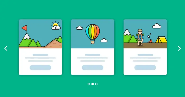
A variety of engrossing components combine in the constantly changing field of web design to produce an immersive online experience. The scrolling banner, often known as a carousel or slider, is one such element that has grown significantly in popularity. This dynamic feature has completely changed how websites present their content, drawing in users and delivering messages in an interesting and aesthetically pleasing way. The purpose, advantages, design considerations, and potential hazards of the sliding banner are all explored in detail in this article. What is the sliding banner on a website called?

The Purpose of a Sliding Banner
A sliding banner acts as a digital billboard that welcomes visitors with an enticing selection of pictures, movies, and messages that change randomly or in response to user input. Its main goal is to quickly grab the audience’s attention and deliver crucial details about the website’s products or promotions. The sliding banner is a flexible tool for communication and engagement that may be used to showcase new product introductions, display portfolio items, or share significant information. https://diversewebsitedesign.com.au/website-design-preston/
Benefits of Implementing a Sliding Banner
A sliding banner’s incorporation into a website’s design has the following significant advantages:
Enhanced Visual Appeal: Sliding banners make use of appealing graphics and multimedia components to provide an immediate and positive first impression on users.

Websites frequently have a limited amount of area to present several critical messages or promotions. By switching between different information components, a sliding banner makes effective use of the available area.
Variety of Messages: Sliding banners allow websites to transmit a wide range of information without overwhelming the viewer because they can display several messages in a single space.
User Engagement: Users are more likely to interact with sliding banners since they are interactive. Visitors have the option of pausing the rotation to concentrate on a particular item of interest or manually navigating through the information.
Showcase Your Creativity: To create a cutting-edge and contemporary website appearance, web designers can display their talent by creating aesthetically appealing transitions and animations for the sliding banner.
Design Considerations for Sliding Banners
The design of sliding banners must be carefully considered to achieve maximum efficacy even if they present a plethora of opportunities:
Relevance of Content: Each slide should deliver a message that is both clear and pertinent. Instead of overflowing with information, concentrate on material that is compelling and brief.

Visual Consistency: To guarantee a seamless and expert appearance, keep your visual style same throughout all of your slides. A professional design benefits from consistent typefaces, colors, and branding components.
High-resolution graphics and videos might cause a website’s loading speed to be slower. Media files should be optimized to balance visual quality and performance. https://www.dynamicwebdesign.com.au/our-services/custom-website-design/
Provide easy-to-understand navigation buttons, such as arrows or dots, to let visitors pause, examine, or traverse the content of sliding banners at their own pace.
Make sure the sliding banner is responsive so it will work on a variety of screens and devices. It is crucial to provide a consistent user experience across platforms.
Accessibility: Ensure that everyone, including people with impairments, can utilize the sliding banner. Make sure that images include alternate text and that the navigation controls are keyboard-friendly.
Potential Pitfalls and Alternatives
Sliding banners might be visually appealing, but they can have certain drawbacks:
Due to the prominence of sliding banners on many websites, users may become blind to them and unintentionally ignore or miss them.
Information overload: A sliding banner might overwhelm viewers with too much information if it is not well managed, which will lower engagement and retention.

Performance Impact: Long loading times for websites due to large media files and animations may discourage visitors.
Sliding banners might not work effectively on mobile devices because of the constrained screen space. Consider mobile-friendly options like static advertising or shortened information.
Alternatives: As an alternative to a sliding banner, websites can consider using hero photos that are static, video backgrounds, or a grid layout with crucial content bits.
Conclusion
The sliding banner has become a potent tool for enticing and educating website visitors in the dynamic world of web design. The sliding banner has established itself as a standard element in contemporary websites thanks to its capacity to exhibit a variety of content, improve visual appeal, and promote user interaction. But when designing it, care should be taken to take into account things like user accessibility, visually consistent design, and information relevancy. Web designers must continue to adjust their methods as technology advances, striking the ideal harmony between innovation and user-centric design to produce sliding banners that make an impression.


