Letter Size Tips for Web Designers
For the best user experience, make sure your text is readable and visually appealing while developing a website. The size of the typeface used in the design is an important consideration. Your material can be more legible, accessible, and aesthetically pleasing with the appropriate letter size. In this post, we’ll go over some crucial advice for choosing the right font sizes as well as recommended practices for web designers to maintain clarity and uniformity.

Why Letter Size Matters in Web Design
Letter size has a direct impact on how easily your audience can interact with your material, making typography a crucial component of web design. Overly huge writing can overpower the design, and too small font might make it difficult to read. The overall appearance, readability, and accessibility of the website are enhanced by a well-balanced letter size. Why it matters is as follows:
- Readability: Proper letter size helps users read content comfortably, without straining their eyes.
- Accessibility: Appropriate letter sizing ensures that users with visual impairments can engage with your content.
- User Experience: A well-designed site with clear typography enhances the overall user experience, encouraging visitors to stay longer.
Tips for Choosing the Right Letter Size
Choosing the appropriate font size is crucial for well-designed websites. The following advice will help you make the best decisions:
1. Start with a Base Size
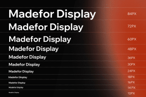
Choose a baseline font size for your website; body text should often range from 16 to 18 pixels. Most people agree that this range is comfortable for them. You can preserve visual hierarchy by adjusting headings and other elements proportionately based on this base size.
2. Use Relative Units
Consider utilizing relative units like ems or rems in place of fixed ones like pixels (px). Because of its increased responsiveness and flexibility, this method makes it simpler to modify the font size to suit different screen sizes or user preferences. For example, scaling other items appropriately is made simple by setting the base size in rems.
3. Maintain Hierarchy
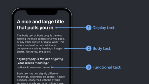
Typographic hierarchy is essential for directing readers through your material. To set headings (h1, h2, h3) apart from body material, use larger font sizes. This is how a typical hierarchy might appear:
- H1: 2.5rem (40px)
- H2: 2rem (32px)
- H3: 1.5rem (24px)
- Body: 1rem (16px)
Keeping your hierarchy intact makes it easier for people to browse and explore your content.
4. Test Across Devices
It’s crucial to check your selected letter sizes on a range of screen widths because there are numerous devices accessible. A desktop’s visual appeal might not transfer well to a mobile device. Make sure your text is readable on all devices by using responsive design strategies. Vary the font size according to the screen width.
5. Pay Attention to Line Length and Spacing
Not only should letter size be taken into account, but line length and spacing are also very important aspects of typography. The ideal line length for reading is between 50 and 75 characters. To provide adequate space between lines, adjust line height (leading), which is typically between 1.4 and 1.6 times the font size. This distance makes reading more comfortable and less taxing on the eyes.

6. Utilize Contrast
For text to be readable, there must be contrast with the background. Make sure there is enough contrast to go along with your letter size in order to improve legibility. A clear separation that enhances the user experience can be achieved by using dark text on a light backdrop or the other way around.
Consider Accessibility
When designing a website, accessibility is quite important. Adhering to regulations is not only crucial, but it also facilitates outreach to a larger audience. The following are some recommended practices for letter size and accessibility:
1. Use High Contrast Colors
Make that the text-to-background color contrast satisfies accessibility guidelines, with a minimum ratio of 4.5:1 for standard text. For those who have visual problems, this contrast is essential.
2. Allow Users to Adjust Font Size
Think about including options that let consumers change the text size to suit their tastes. For those with particular visual needs, this flexibility can greatly improve the experience.
3. Provide Alternative Text
As an alternative to text for any visual element—including pictures and icons—provide alt text. This makes sure that users who might have vision problems can hear descriptions of these elements from screen readers.
Best Practices for Testing Letter Size
It’s crucial to test and adjust your letter sizes after you’ve selected them. The following are some best methods for assessing your typography’s efficacy:
1. Gather User Feedback
Find out what real people think about your font sizes and general design by doing usability testing. Inquire about the participants’ comfort level, reading history, and any challenges they faced.
2. Analyze Analytics
Utilize web analytics software to track user activity. Reevaluating your typeface choices should be the response to readability concerns indicated by high bounce rates or low time on page.
3. Stay Informed
Keep yourself updated about the latest best practices and user preferences in typography as trends change. Make sure your design is up to date with current standards and user expectations by reviewing it on a regular basis.

Conclusion
A crucial aspect of web design that affects readability, accessibility, and user experience is choosing the appropriate font size. You may make your website more interesting and easy to use by implementing these best practices and advice. To make sure that your information reaches and resonates with all readers, keep in mind to emphasize accessibility, test across devices, and maintain a clear typographic hierarchy. A thoughtful approach to letter sizing can improve the look and feel of your website and make a big impact on visitors.
Tips for Letter Size in Web Design
For the best user experience, make sure your text is readable and visually appealing while developing a website. The size of the typeface used in the design is an important consideration. Your material can be more legible, accessible, and aesthetically pleasing with the appropriate letter size. In this post, we’ll go over some crucial advice for choosing the right font sizes as well as recommended practices for web designers to maintain clarity and uniformity.


