Bold Typography: Making a Statement in Design
Typography plays an essential role in any form of visual communication. Whether it’s in print, digital design, or branding, typography speaks volumes about the tone and personality of a project. Among all typography styles, bold typography is perhaps the most attention-grabbing. It conveys strength, clarity, and confidence, making it a powerful tool in design. But how does one effectively use bold typography to make a statement in design? In this article, we will explore the impact of bold typography, how to incorporate it, and best practices for using bold fonts in different design contexts.
The Power of Bold Typography
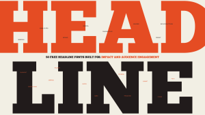
Bold typography is not just about making text larger or thicker—it’s about making an impression. This style of typography is designed to stand out, capture attention, and communicate messages clearly and assertively. Its usage can significantly impact the viewer’s perception of a brand, a product, or a message, making it a critical element in design.
The Impact on Visual Hierarchy
In any design, visual hierarchy dictates the order in which information is consumed. Bold typography can enhance this hierarchy by drawing attention to the most important elements on a page or screen. For example, headlines or subheadings in bold fonts immediately stand out, helping users quickly understand the structure of the content. This leads to better readability and engagement, especially in environments where users skim through content, like websites or advertisements.
Creating Emphasis and Focus
Using bold typography is a great way to create emphasis within a design. When you need to highlight a keyword, a product name, or a crucial message, bold typefaces serve as visual signals to draw attention. In marketing materials, for instance, bold typography can be used to highlight discounts, promotions, or key features of a product, ensuring that the message is not lost in the sea of other text.
Applications of Bold Typography in Design
Bold typography isn’t limited to one particular medium. It has versatile applications across various design fields, each with its unique benefits. Let’s take a closer look at how bold fonts are used across different design contexts.
Branding and Logos
One of the most iconic uses of bold typography is in branding and logos. A well-designed logo with bold typography can instantly communicate a brand’s personality. Think about brands like Coca-Cola, Netflix, or Adidas—each uses bold fonts to establish their presence in a crowded market. Bold fonts in logos are memorable, easy to read, and instantly recognizable, making them a crucial part of any brand identity.
Bold typography in logos also helps reinforce the message the brand wants to communicate. For example, a bold, strong font may signal power, reliability, and professionalism, while a playful bold font might express fun and creativity. By choosing the right bold typeface, designers can shape the perception of a brand before the consumer even interacts with it.
Advertising and Marketing Materials
Bold typography is a staple in advertising. Whether it’s a billboard, a social media ad, or a print flyer, bold fonts are often used to make key information pop. In advertisements, bold typography typically emphasizes discounts, deadlines, or other critical information. The striking nature of bold fonts ensures that these messages are not overlooked by potential customers.
In digital marketing, bold typography is even more critical due to the constant bombardment of content that consumers face. Whether it’s an email subject line or a banner ad, bold text cuts through the noise and directs the viewer’s attention to the intended message.
Web and UI Design
In the digital realm, web and user interface (UI) design often rely on bold typography for readability and user engagement. On websites, bold fonts are commonly used in headings, call-to-action buttons, and navigation links. They serve not only as visual cues but also help users quickly identify the most critical elements of a page, improving overall usability.
In UI design, where clarity and simplicity are paramount, bold typography can provide contrast against other elements, such as images or subtle backgrounds. By using bold fonts for buttons or navigation menus, designers can ensure these elements stand out and are easily clickable, enhancing the overall user experience.
Best Practices for Using Bold Typography
While bold typography is a powerful tool, it’s essential to use it correctly to achieve the desired impact. Overusing bold fonts or misapplying them can lead to visual clutter or undermine their effectiveness. Here are some best practices for using bold typography in your designs.
Use Sparingly
Bold typography is meant to be used for emphasis. Using it sparingly ensures that it retains its ability to make an impact. When everything on the page is bold, the emphasis is lost, and the viewer may feel overwhelmed. Therefore, it’s best to reserve bold fonts for key pieces of information, such as headings, subheadings, or important calls to action.
Maintain Legibility
One of the primary reasons for using bold typography is to ensure legibility. It’s important to choose a bold font that is easy to read, even at smaller sizes. Some fonts, when bolded, can become hard to read due to the thickness of their strokes or tight letter spacing. Always test your bold typography in various sizes and ensure that it remains legible across different devices and mediums.
Pair Bold Fonts with Lighter Fonts
To maintain balance in a design, it’s a good idea to pair bold typography with lighter, more neutral fonts. This creates contrast and prevents the design from feeling too heavy. A bold headline paired with a regular or light body font provides visual balance, ensuring that the text hierarchy is maintained while also providing enough white space for a clean and organized layout.

Consider the Emotional Impact
Typography isn’t just about aesthetics—it also communicates emotions. Bold fonts can convey strength, urgency, excitement, and confidence. When selecting a bold font for your design, consider what emotional tone you want to communicate. A strong sans-serif typeface might be used to convey stability, while a rounded, playful bold font might evoke a sense of fun and approachability.
Conclusion: Bold Typography for Impactful Design
Bold typography is a versatile and powerful tool in any designer’s arsenal. It has the ability to command attention, organize content, and communicate with clarity. When used thoughtfully, bold fonts can create powerful statements, elevate brand identity, and guide users through a digital experience. From logos to websites to marketing campaigns, bold typography leaves a lasting impression.
By adhering to best practices—using bold typography sparingly, ensuring legibility, pairing it with lighter fonts, and understanding its emotional impact—designers can harness the full potential of bold typography. In the world of design, where first impressions matter, bold typography is a tool that ensures your message is seen, heard, and remembered.