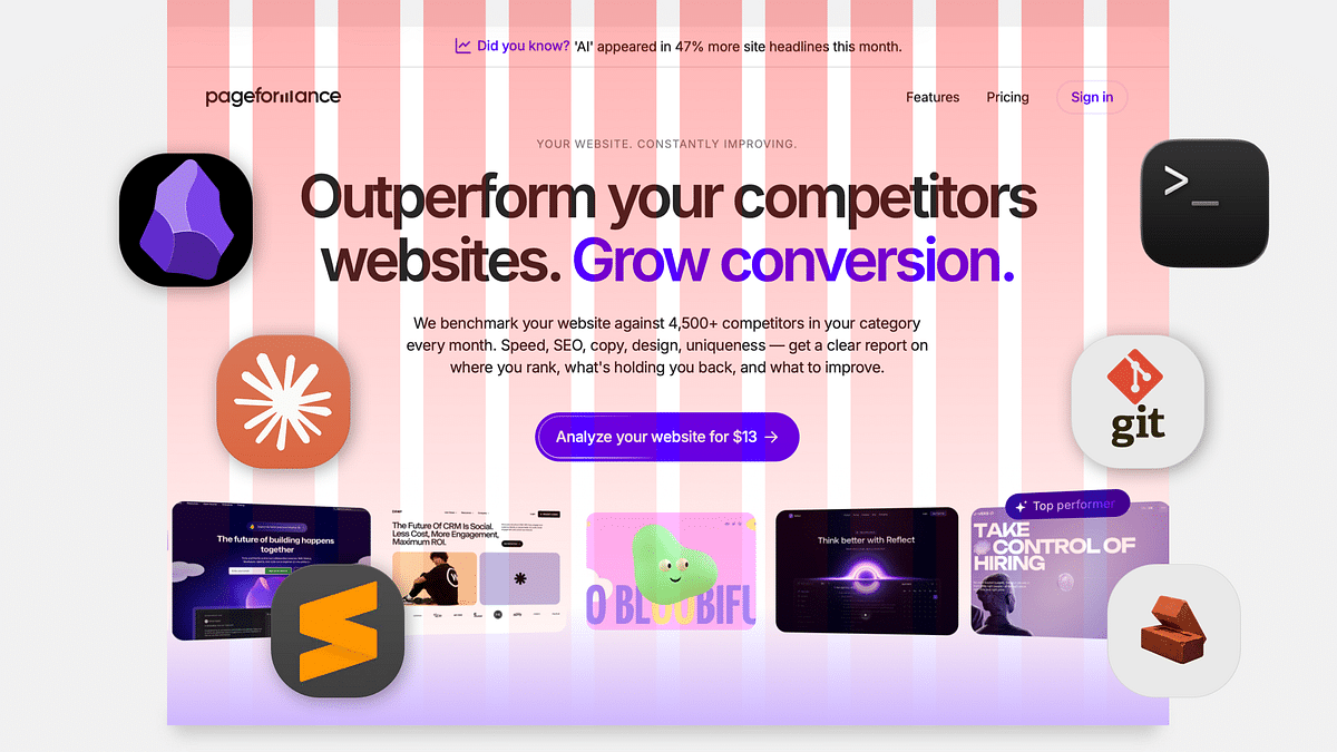
Overlapping text is a popular design technique used in various media, including websites, social media posts, and marketing materials. It involves layering text elements on top of each other to create a visually appealing and engaging design. In this blog post, we will explore the benefits of using overlapping text and some tips for implementing it effectively.
Benefits of Overlapping Text
- Visual Appeal: Overlapping text adds a dynamic and layered look to your design, creating visual interest and drawing the viewer’s attention.
- Emphasis: By overlapping text, you can create emphasis on important words or phrases, making them stand out and increasing their impact.
- Hierarchy: Overlapping text can be used to create a hierarchy of information, with the most important text in the foreground and the less important text in the background.
- Space Optimization: Overlapping text can be used to fit more information in a smaller space, making it ideal for designs with limited space, such as social media posts or ads.
Tips for Implementing Overlapping Text
- Keep it Simple: Overlapping text can quickly become overwhelming if there is too much going on. Keep it simple by using only two or three text elements, and ensure that they are easy to read and not too cluttered.
- Choose Complementary Fonts: When overlapping text, it’s important to choose complementary fonts that work well together. Avoid using fonts that are too similar, as this can create confusion and make the text harder to read.
- Use Contrast: Overlapping text can be hard to read if there is not enough contrast between the text and the background. Make sure the text is easy to read by using contrasting colors or adding a background shape behind the text.
- Mind the Kerning: Kerning refers to the spacing between letters, and it’s important to ensure that the spacing is consistent and not too tight or too loose. This can be especially important when overlapping text, as it can impact the readability of the text.
- Test, Test, Test: When implementing overlapping text, it’s important to test the design on different devices and screen sizes to ensure it’s still easy to read and visually appealing.
In conclusion, overlapping text is a versatile and engaging design technique that can add a dynamic look to your designs. By following these tips and keeping it simple, you can create designs that are visually appealing and easy to read, making your message stand out and increasing its impact.


