
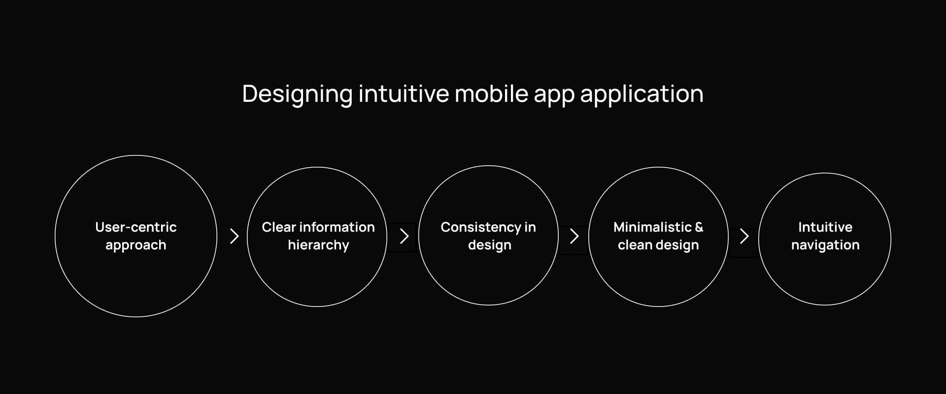
Designing Intuitive Navigation Without Sacrificing Creativity
When it comes to web design, few challenges are as crucial—or as creatively tricky—as designing intuitive navigation without sacrificing creativity. Visitors expect to find what they’re looking for quickly, but they also want to be inspired, delighted, and even surprised along the way. How do you strike a balance between clarity and innovation?
In this post, we’ll guide you step-by-step through creating a navigation experience that’s both intuitive and beautifully creative. Whether you’re a designer working on your next big project or a startup founder aiming to make a memorable first impression, this guide will help you craft user-friendly navigation without losing your visual edge.
Why Navigation Matters More Than Ever
Good navigation is like a good tour guide—it helps users move through your site with ease and confidence. Poor navigation? That’s like being dropped in a new city without a map. You risk frustrating users, increasing bounce rates, and losing potential conversions.
But here’s the catch: in today’s competitive landscape, it’s not enough to be functional. Your site also needs to stand out. That’s where creative navigation comes in. When done right, it adds character and brand identity without compromising usability.
Step-by-Step Guide to Designing Intuitive Navigation Without Sacrificing Creativity
1. Start with User Research and Journey Mapping
Before you dive into wireframes or visual styles, you need to know who your users are and how they’ll interact with your site.
-
Interview or survey users to understand their goals.
-
Map out typical user journeys to identify key interaction points.
-
Identify content priorities—what absolutely must be easy to find?
Pro Tip: Use tools like Hotjar or Crazy Egg to track user behavior on your current site, if available.
2. Establish a Clear Information Architecture (IA)
No amount of creative styling can fix a confusing site structure. Start by organizing your content logically.
-
Group related content together under categories.
-
Limit the number of top-level menu items (5–7 is a common rule).
-
Create a sitemap to visualize hierarchy.
Creativity thrives on structure. A clear IA gives you the foundation you need to innovate on the interface without losing your users.
3. Wireframe First, Design Second
Sketch out low-fidelity wireframes to plan the layout and user flow before adding any creative design elements.
-
Focus on layout, spacing, and hierarchy.
-
Test the wireframe with a few users or team members.
-
Iterate quickly before investing time in visuals.
Wireframes help you isolate usability from aesthetics, ensuring your navigation is functional before it’s flashy.

4. Design for Familiarity—Then Innovate
Users expect certain navigation patterns. There’s a reason why most sites place navigation at the top or in a hamburger menu on mobile.
-
Use common UI patterns to make navigation feel natural.
-
Once the core structure is familiar, add creative twists: animations, hover effects, unique fonts, or micro-interactions.
Examples of creative but intuitive navigation:
-
Apple: Minimalist top nav with immersive product pages.
-
Airbnb: Search-first experience that keeps filters easy to access.
-
Portfolio sites: Horizontal scrolls or animated transitions that still maintain clarity.
5. Use Visual Hierarchy to Guide the Eye
Your navigation elements should be easy to find—but not overwhelming.
-
Use contrast and scale to highlight key menu items.
-
Whitespace is your friend—don’t cram too much into your nav.
-
Icons or images can help guide users when used sparingly and thoughtfully.
A well-designed visual hierarchy creates an intuitive flow through your site—even when you incorporate creative layouts.
6. Don’t Forget Mobile and Accessibility
Creativity should never come at the expense of inclusivity or responsiveness.
-
Design with mobile-first principles in mind.
-
Use large tap targets, simple menus, and sticky headers.
-
Ensure screen reader compatibility and proper keyboard navigation.
Test on different devices and assistive technologies to make sure everyone can navigate your site comfortably.
7. Test Early, Test Often
The best navigation designs are backed by data.
-
Use usability testing tools (like Maze or UserTesting).
-
Conduct A/B tests on different navigation styles or labels.
-
Analyze bounce rates and session duration to spot issues.
Creativity should evolve based on user feedback—not just design instincts.
8. Delight With Small Creative Touches
Once the foundation is solid, you can enhance the user experience with delightful, brand-aligned elements.
-
Subtle animations or transitions.
-
Playful hover effects that align with your brand.
-
Unique but descriptive menu labels that create personality.
These finishing touches elevate your design without disrupting usability.
Common Mistakes to Avoid
Even the most creative designers can fall into common traps when designing navigation. Watch out for:
-
Overloading the nav menu with too many items.
-
Using vague or clever labels that aren’t instantly understandable.
-
Prioritizing form over function (e.g., hiding menus behind confusing icons).
-
Inconsistent navigation between mobile and desktop versions.
Remember: the goal is to create an experience that’s easy to use and memorable—not just one or the other.
FAQs About Designing Intuitive and Creative Navigation
Q: Can a hamburger menu be intuitive and creative?
A: Yes—but context is key. While it’s common on mobile, desktop users may overlook it. You can make it more intuitive by labeling it (“Menu”) or adding animations that guide the user. Get creative with the opening transitions or icon design to reinforce branding.
Q: How do I make my navigation stand out visually?
A: Use typography, spacing, color, and subtle motion. Try unique layouts like fixed side menus or split navigation, but only if your audience won’t find them confusing. Let the creative elements support usability—not fight it.
Q: Is minimal navigation always better?
A: Not necessarily. Minimalism works when the user’s goals are simple and direct. But for content-heavy sites like news portals or e-commerce, a more comprehensive (but well-organized) nav system is essential.
Q: How do I test if my navigation is intuitive?
A: Start with five-second tests—ask users what they’d click to find a certain piece of information. Heatmaps and click tracking are also useful. Watch where users hesitate, and refine accordingly.
Final Thoughts
Designing intuitive navigation without sacrificing creativity is absolutely possible—it just takes a thoughtful, user-centered approach. Start with solid structure and usability, then layer on creative touches that reflect your brand and delight your audience.
In the end, the most memorable sites are those that work beautifully and look beautiful doing it.
Ready to Rethink Your Navigation?
If your website’s navigation is confusing or uninspiring, it might be time for a redesign. Start by mapping out your user flows and information architecture—then use this guide to bring creativity into the picture.
Whether you’re designing a portfolio, SaaS dashboard, or e-commerce platform, intuitive navigation can elevate your site—and your brand.
Bonus: Checklist for Creative Yet Intuitive Navigation
-
✅ User journeys mapped
-
✅ Clear information hierarchy
-
✅ Familiar UI patterns in place
-
✅ Mobile-first responsive design
-
✅ Accessibility built-in
-
✅ Creative touches aligned with brand


