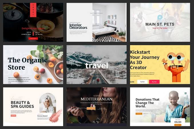
The main types of images for websites are hero images, photographs, product images, illustrations, icons and logos, infographics, thumbnails, background images and screenshots. Each one does a different job, from building trust to explaining a service, and each needs the right file format, descriptive alt text, set dimensions and sensible loading so it helps your SEO instead of slowing your site down.
This guide explains what each image type does, when to use it, and how to optimise it for Google, AI search tools and real visitors. Last updated 31 October 2026.
In this guide
- Why images matter for SEO and conversions
- The 9 essential types of images
- Which image format should you use?
- Image SEO best practices
- Images, AI search and visual search
- Common image mistakes
- Frequently asked questions
Why Images Matter for SEO and Conversions
Images do three jobs at once. They help visitors understand your offer faster than text can, they build trust by showing the real business behind the website, and they give search engines extra context about the page. Google also shows images in Google Images, Discover and the thumbnails beside regular search results, so a well-optimised image can bring in traffic on its own (see Google’s image SEO guidelines).
The catch is file weight. Google points out that images are often the biggest contributor to total page size, which is what makes pages slow to load. A slow page loses visitors and rankings, so every image has to earn its place. If your site already feels sluggish, start with our guide to why your website is loading so slowly.
The 9 Essential Types of Images for Websites
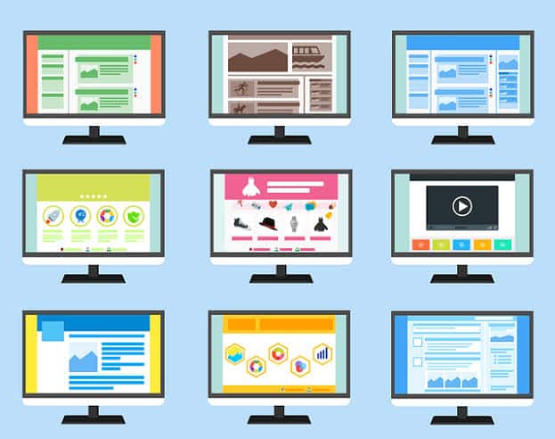
1. Hero Images
A hero image is the large banner at the top of a page, usually the homepage. It is the first thing visitors see, so it should show your business, product or result at a glance and leave room for a clear headline and call to action. Because the hero is normally the largest element above the fold, it has the biggest effect on load speed: compress it, set its dimensions and never lazy-load it (more on that below). Check how it crops on a phone too, which our mobile-first web design guide covers. Considering a rotating banner instead? Read 7 creative ways to use slider banners first.

2. Photographs (Original and Stock)
Photographs make a site feel human. Real photos of your team, premises, vehicles and finished work are the most persuasive images you can use, because visitors can tell when a photo is generic. Use original photography on your homepage, About page and service pages. Phone photos are fine if the lighting is good, as long as you resize and compress them before uploading.
Stock photos still suit abstract backgrounds and supporting visuals, but check the licence. Most stock images are not copyright-free, and licences can limit where, for how long and in which region you can use them (Sprintlaw explains what Australian businesses need to know).
3. Product Images
Product images are essential for online stores. Show each product from several angles, include a close-up of key details and at least one in-use shot, and keep backgrounds and lighting consistent across the catalogue. Give every image its own descriptive file name and alt text (product name, colour and view), and add Product structured data so Google can connect the images to price and availability. Our guides to product page design and eCommerce website design go further.
4. Illustrations
Illustrations explain ideas that are hard to photograph, such as software, finance, a process or a service with no physical product. They also give a brand a distinct personality. Keep one consistent style across the whole site, and save simple illustrations as SVG so they stay sharp at every screen size and weigh almost nothing.
5. Icons and Logos
Icons and logos are small graphics that signal meaning quickly: a phone icon beside your number, a tick beside a benefit, your logo in the header. Use SVG so they scale cleanly, keep the style consistent and use them sparingly. If an icon is purely decorative, give it an empty alt attribute (alt="") so screen readers skip it. If it works as a button or link, give it an accessible label. Your logo’s alt text should be your business name. For more, see logo or favicon: do you need both? and our logo design service.
6. Infographics and Diagrams
Infographics turn data or a process into something a visitor can absorb in seconds, and they are easy to share. Search engines cannot reliably read text baked into an image, so repeat the key points as normal text near the infographic and write alt text that summarises what it shows. Check that the text is still legible on a phone.
7. Thumbnails
A thumbnail is a small preview image that leads to a larger image or a full page, as in blog cards, galleries and product listings. Use a consistent aspect ratio, make sure the subject is clear at a small size, and serve a properly resized file rather than squeezing a huge image down with CSS. When the thumbnail is the link, its alt text acts as the anchor text, so describe where it leads.
8. Background Images
Background images add texture or atmosphere behind text and sections. Keep them subtle so text stays readable (check the contrast) and keep the files light. There is one technical catch: Google does not index images set through CSS, and many page builders apply section backgrounds that way. Use background images for decoration only. If an image carries meaning, or you want it to appear in Google Images, place it with a standard <img> element instead.
9. Screenshots
Screenshots prove what you are describing: a dashboard, a before-and-after, a finished website or a step in a tutorial. Crop to the relevant area, annotate what matters and add a caption. In the alt text, describe what the screenshot demonstrates rather than just calling it a screenshot. Screenshots of finished projects, like the ones in our recent work, are some of the strongest trust signals a service business can publish.
Which Image Format Should You Use?
For most websites in 2026, use WebP for photos and graphics, SVG for logos and icons, and AVIF where you want the smallest possible files, with JPEG or WebP as a fallback. Google Search can index BMP, GIF, JPEG, PNG, WebP, SVG and AVIF, so your choice will not limit search visibility.
| Format | Best for | Notes |
|---|---|---|
| WebP | Photos, banners and most graphics | Smaller than JPEG and PNG at similar quality and supported by all modern browsers. A safe default. |
| AVIF | Photos and hero images where every kilobyte counts | Often smaller than WebP. Support is broad but not universal, so serve it with a fallback. |
| JPEG | Photographs (as a fallback) | Works everywhere, but the files are larger than WebP or AVIF. |
| PNG | Graphics that need transparency, crisp screenshots | Heavy for photos. Try WebP first. |
| SVG | Logos, icons, simple illustrations | Vector format that scales perfectly and is tiny. Not suitable for photos. |
| GIF | Avoid where possible | Heavy and low quality. Use a short video or animated WebP instead (see integrating motion graphics without slowing your site). |
You can offer several formats at once with the HTML <picture> element. The browser picks the first format it supports, and the <img> tag provides the fallback:
<picture>
  <source type="image/avif" srcset="plumber-hero.avif">
  <source type="image/webp" srcset="plumber-hero.webp">
  <img src="plumber-hero.jpg"
       alt="Plumber repairing a kitchen tap in a Melbourne home"
       width="1600" height="900" fetchpriority="high">
</picture>
Google reads the <img> element inside a <picture>, so your alt text still counts. In WordPress, an image optimisation plugin can create WebP versions and serve them automatically, and a CDN can negotiate the best format for each visitor (see CDN benefits for faster websites).

Image SEO Best Practices
These nine habits cover almost everything search engines and visitors care about.
Write descriptive alt text
Alt text describes what an image shows, in the context of the page. It lets screen-reader users follow your content, and Google describes it as the most important attribute for giving an image metadata. Write it the way you would describe the image to someone over the phone: specific, natural and usually under about 125 characters. Use your keyword only where it genuinely fits.
- Missing:
<img src="hero.jpg"> - Stuffed:
alt="website design melbourne cheap web designer best website" - Good:
alt="Melbourne cafe website shown on a laptop and a phone"
Purely decorative images should use an empty alt="". The W3C image accessibility tutorial is a good reference, and our post on website accessibility explains why it matters.
Use descriptive file names
Rename images before you upload them. melbourne-cafe-website-homepage.webp tells Google far more than IMG_2847.jpg. Keep names short, lowercase and hyphenated, with one clear phrase and no keyword stuffing.
Compress and resize every image
Resize each image to the largest size it will actually display at, rather than uploading the 6,000-pixel original from the camera, then compress it. As a rule of thumb, aim for under about 200 KB for most content images and keep hero images as light as quality allows. Test your pages with PageSpeed Insights, and see our roundup of website performance testing tools and 30 website optimisation tips.
Set width and height attributes
Adding width and height lets the browser reserve space before the image loads. That stops the page jumping around as images arrive, which is what Cumulative Layout Shift, one of the Core Web Vitals, measures.
Lazy-load below the fold, but never the hero image
Adding loading="lazy" to images further down the page means they load only as visitors scroll, which saves bandwidth and speeds up the first view. Do not lazy-load the hero or any image visible when the page first opens. It is usually the Largest Contentful Paint element, and delaying it hurts your Core Web Vitals. Give it fetchpriority="high" instead. Lazy-loading everything is one of the most common image mistakes we see on older sites.
Use responsive images
A phone does not need a 2,000-pixel-wide image. Use srcset and sizes (or the <picture> element) so each device downloads an appropriately sized file, and always keep a src fallback, because some browsers and crawlers do not understand srcset. WordPress adds srcset automatically to images inserted from the media library.
Use real image elements and put images near relevant text
Google finds images through standard <img> elements and uses the surrounding text, headings and captions to work out what they show. Place each image beside the content it illustrates, and add a caption where it helps the reader.
Include images in your XML sitemap
An image sitemap helps Google discover images it might otherwise miss, and it can include images hosted on a CDN. Most SEO plugins can add images to your existing sitemap with a single setting.
Choose a strong preferred image for search and social
Google chooses preview images automatically, but you can influence the choice through the og:image meta tag or schema.org image markup. Pick a high-resolution image that represents the page, and avoid logos, images with text overlaid and extreme aspect ratios. A 1200 x 630 pixel image is the standard size for social sharing.
Images, AI Search and Visual Search
Google Lens, AI search tools and answer engines are getting better at understanding what is in an image, but they lean on the same signals as traditional SEO: a clear subject, descriptive alt text and captions, relevant surrounding copy, fast loading and original content. There is no separate trick for AI. Original, clearly labelled images of your own work, placed beside helpful text, are the safest long-term investment because they are distinctive, whereas a generic stock photo can appear on many other sites.
Common Image Mistakes on Small Business Websites
- Uploading full-size camera or phone photos without resizing or compressing them.
- Relying on generic stock photos that your competitors also use.
- Leaving alt text blank, or stuffing it with keywords.
- Putting important text inside images, where search engines and screen readers cannot use it reliably.
- Lazy-loading the hero image.
- Mixing image styles so the site looks stitched together.
- Using stock images without checking the licence.
Each one is quick to fix and worth checking on any older site. For a wider list, see common website design mistakes and how to avoid them.
Frequently Asked Questions
What are the main types of images used on websites?
The main types are hero images, photographs, product images, illustrations, icons and logos, infographics, thumbnails, background images and screenshots. Most websites use a mix: a hero image and original photos to build trust, icons and illustrations to guide and explain, and optimised product images or screenshots as proof.
What is the best image format for websites?
WebP is the best all-round default for photos and graphics in 2026. Use SVG for logos, icons and simple illustrations, and consider AVIF for even smaller files with a JPEG or WebP fallback. Google Search can index all of these formats.
How big should website images be?
There is no single size. Resize each image to the largest dimensions it will display at, then compress it. As a rule of thumb, aim for under about 200 KB for most content images, and always set width and height attributes so the page does not jump while loading.
Does alt text help SEO?
Yes. Google describes alt text as the most important attribute for providing image metadata, and it also makes your site accessible to people using screen readers. Describe the image clearly and naturally, include a keyword only where it fits, and use an empty alt attribute for purely decorative images.
Should I use stock photos or my own photos?
Use your own photos wherever trust matters, such as your homepage, About page and service pages, because visitors can spot generic stock images. Stock photos work for supporting visuals as long as the licence covers your use. Even basic, well-lit photos of your real team and work tend to build more credibility.
Should I lazy-load all my images?
No. Lazy-load images below the fold, but load your hero image and any other image visible on first view immediately, ideally with fetchpriority set to high. Lazy-loading the main above-the-fold image can slow your Largest Contentful Paint and hurt your Core Web Vitals.
Need Help With Your Website Images?
At Diverse Website Design we build fast, search-friendly websites for Australian businesses, with image optimisation, performance and on-page SEO built in. Explore our website design and search engine optimisation services, browse our recent work, or contact us or call 1300 661 518 for a chat. Thinking about hiring a designer? Read how to choose a web designer in Australia first.