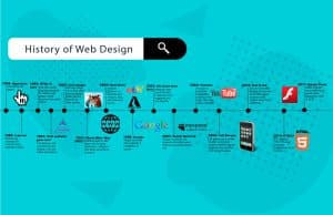
Since the beginning of the internet, there has been a remarkable evolution in the design of websites because of the internet. The journey of web design is a reflection of the progression of technology and the shifting expectations of users. It begins with straightforward text-based pages and progresses to more complex and interactive designs. This page provides a visual timeline of the progression of web design during its evolution, taking you through the important milestones that have occurred throughout its history.

The Early Days: Text-Based Webpages
The Birth of the Internet
It wasn’t until 1991 that Tim Berners-Lee launched the very first website, despite the fact that the internet had been around since the late 1980s. These early websites were entirely composed of text, were equipped with hyperlinks, and utilized fundamental formatting. There were no films, photos, or any other sort of content that could be interacted with.
The Advent of HTML
Web developers were given the ability to format text by using headings, paragraphs, and links thanks to the introduction of HTML, which stands for HyperText Markup Language. Due to the fact that it standardized the manner in which information was shown on the web, HTML was able to establish the groundwork for the future of web design, despite the restrictions it possessed.
The Rise of Visual Design: 1995-2000
Introduction of Images and Graphics
In the middle of the 1990s, images and graphics were first used into the design of websites. There was a widespread adoption of GIFs and JPEGs, which made it possible for websites to become more visually appealing. Additionally, during this time period, web browsers such as Netscape Navigator came into being, which were capable of supporting more advanced HTML features. https://diversewebsitedesign.com.au/website-designer/-toowoomba/
Table-Based Layouts
HTML tables were initially utilized by web designers in order to accomplish more intricate designs. Better control over the layout was made possible as a result of this, which made it possible to create designs with several columns. Nevertheless, table-based layouts were difficult to use and frequently led to code that was too lengthy.
The Flash Era: 2000-2005
The Emergence of Flash
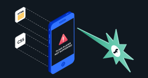
The macromedia Through its ability to facilitate the production of animations, interactive content, and multimedia experiences, Flash brought about a revolution in online design. Flash-based websites were extremely entertaining, with images and sound that were constantly changing. In spite of its widespread use, Flash was not without its downsides, which included slower loading times and incompatibility with some electronics.
Introduction of CSS
In the late 1990s, CSS (Cascading Style Sheets) was first released, but it wasn’t until the early 2000s that it began to gain popularity. With the help of CSS, designers were able to segregate the design from the information, which made it much simpler to manage and update websites. Consequently, this signified a substantial change toward HTML that was more semantic and code that was cleaner.

The Web 2.0 Revolution: 2005-2010
Focus on User Experience
In the period of Web 2.0, there was a fresh emphasis placed on the user experience. Websites grew more user-friendly and interactive as a result of the incorporation of technologies such as social media integration, user-generated content, and AJAX, which provides dynamic page updates without requiring the page to be reloaded.
Rise of Minimalism
There was a shift in design trends toward minimalism, which places an emphasis on simplicity and usefulness. Good web design is characterized by having clean layouts, a sufficient amount of white space, and navigation that is easy to understand. In addition, the utilization of gradients, shadows, and shiny buttons became increasingly common.
The Mobile-First Approach: 2010-2015
Responsive Web Design
Because of the proliferation of mobile devices like smartphones and tablets, responsive web design has become increasingly important. Ethan Marcotte was the one who first introduced the concept of responsive design in the year 2010, which assured that websites appeared and functioned properly on all devices, regardless of the screen size. By utilizing media queries, fluid pictures, and flexible grids, this technique was successful.
HTML5 and CSS3
The capabilities of web design were improved with the introduction of additional elements, properties, and styles that were introduced by HTML5 and CSS3. The HTML5 standard offered new features including as support for video and audio, while the CSS3 standard introduced animations, transitions, and complex layout options. These developments made it possible to create designs that were more creative and engaging.
The Modern Era: 2015-Present
Flat Design and Material Design
Around the middle of the 2010s, flat design, which is characterized by features that are simple and two-dimensional, became fashionable. Clarity and usefulness were prioritized in this movement, with a particular emphasis placed on typeface and color. Material Design, which was developed by Google, pushed flat design to a higher level by using subtle shadows and animations, so producing a user experience that was more tactile and responsive.
Microinteractions and Animations
The incorporation of microinteractions, which are subtle animations and feedback mechanisms that promote user engagement, is becoming increasingly common in contemporary web design. These brief animations provide a functional purpose and offer visual feedback, which makes user interfaces more user-friendly and entertaining to interact with.
Voice User Interface (VUI)
A significant impact on web design has been brought about by the proliferation of voice assistants such as Siri, Alexa, and Google Assistant, which has resulted in the creation of voice user interfaces (VUIs). Currently, websites have begun to incorporate voice search and commands, so offering users with a hands-free experience.
The Future of Web Design
Artificial Intelligence and Machine Learning
The field of web design is about to undergo a revolution thanks to artificial intelligence (AI) and machine learning. Tools driven by artificial intelligence have the ability to automate design activities, evaluate user behavior, and personalize information. In order to improve the user experience as a whole, machine learning algorithms can make predictions about the preferences of users.
Augmented Reality (AR) and Virtual Reality (VR)
Immersive experiences can be created by the use of augmented reality and virtual reality technology into web design, which are becoming increasingly accessible. By way of illustration, augmented reality (AR) might be utilized by e-commerce websites to enable clients to picture products in their surroundings, whereas virtual reality (VR) can offer virtual tours and interactive encounters.
Continued Focus on Accessibility
Accessibility will continue to be an important focus in the design of websites. Not only is it a legal need, but it is also an ethical requirement to make sure that websites are accessible to those who have impairments. All future designs will continue to place an emphasis on inclusiveness and will implement best practices in order to ensure that the web is accessible to all users.

The evolution of web design is a tribute to the quick rate of technology advancement as well as the shifting expectations of users. A significant amount of progress has been made in the field of web design, which has progressed from the simple text-based pages of the early internet to the complex and interactive experiences of today. In the future, developing technologies such as artificial intelligence, augmented reality, and virtual reality have the potential to elevate web design to new heights by making it more personalized, immersive, and inclusive.


