What a Landing Page Looks Like: Crafting the Perfect Digital Welcome

Introduction
A landing page has evolved as a critical tool for success in the ever-changing landscape of digital marketing and online enterprises. A well-designed landing page acts as a virtual portal, inviting visitors and converting them into prospective clients. It’s the digital version of making a good first impression, where every detail counts. In this post, we’ll look at the architecture of a landing page, focusing on the main elements that make it effective and attractive. What a landing page looks like?
1. The Purpose of a Landing Page
A landing page is, at its heart, a standalone web page developed with a specific purpose in mind. A landing page, as opposed to a website’s homepage, which serves as a generic entrance point, is highly specialized and targets a specific audience. Its main goal is to get visitors to do something, like as sign up for a newsletter, download an ebook, or make a purchase.
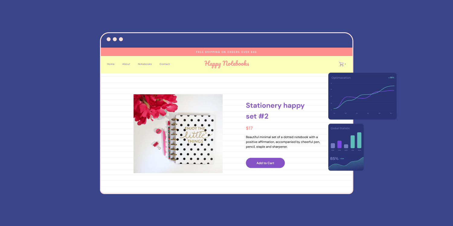
2. Headline (H1 Tag)
The headline, which is commonly represented in HTML by the h1> tag, is the first thing visitors view when they land on a website. It should be simple, succinct, and captivating. The headline sets the tone for the rest of the page and should be relevant to the landing page’s aim. Whether marketing a product, offering a special offer, or presenting useful content, the headline must effectively express the essential message. For diverse landing page design see here.

3. Subheadings (H2 Tags)
After attracting the audience’s attention with the headline, use subheadings, denoted by the h2> tags, to add extra context and information. Each subheading should be related to the primary headline and introduce the various landing page parts. It makes the website more scannable and user-friendly by breaking down the content into easily digestible bits.
4. Call-to-Action (CTA)
The ultimate purpose of a landing page is to convert visitors into leads or customers. The Call-to-Action (CTA) is critical in doing this. The CTA should be visually appealing, widely displayed, and clearly inform visitors on what action they should take. CTAs commonly used include “Sign Up Now,” “Download the Guide,” and “Get Started Today.” It is critical to utilize action-oriented language that fosters instant participation.
5. Engaging Visuals
Humans are visual creatures, and enticing graphics may greatly improve the appeal of a landing page. Relevant and high-quality photographs or videos can serve to illustrate the product or service being given and elicit emotions that are meaningful to the target audience. To provide a great user experience, it’s critical to find a balance between eye-catching aesthetics and fast-loading page elements.

6. Persuasive Copy
The spine of each landing page is compelling copy. It should be convincing, customer-focused, and communicate the value offer clearly. Addressing the audience’s pain points and demonstrating how the product or service addresses their problems can enhance conversion rates. It is critical that the text be short and easy to grasp, with no jargon or superfluous fluff.
7. Social Proof
Social proof is extremely important in the digital arena for establishing trust and credibility. Testimonials, reviews, case studies, and user-generated material are effective techniques for highlighting positive consumer experiences. Visitors are more likely to feel secure in taking action if they see that others have benefited from the service.
8. Trust Indicators
Visitors can be assured that the landing page is legitimate and secure by using trust indicators. Trust can be established in a variety of ways, including the display of security badges, privacy policies, partnership logos, or certifications. These aspects serve to ease any reservations visitors may have about disclosing personal information or making a purchase.

9. Mobile Responsiveness
In today’s mobile-dominated world, it is critical to ensure that the landing page is fully responsive on all devices. The website should adapt to changing screen sizes fluidly, retaining its usefulness and visual appeal on smartphones, tablets, and desktop computers alike. High bounce rates and missed chances can result from a poor mobile experience.
10. A/B Testing and Optimization
It is an iterative process to create the ideal landing page. A/B testing allows marketers to compare alternative landing page versions and identify which features perform best. Changes to the CTA, headline, images, or form fields can all have a big impact on conversion rates. Continuous optimization based on data-driven insights is essential for enhancing the effectiveness of the landing page.
Conclusion
Finally, a well-designed landing page may be a game changer for any online business. Every element, from the attention-grabbing title (H1 tag) to the convincing language and captivating images, should work in unison to guide visitors to the Call-to-Action (CTA). Trust indicators and social evidence encourage trust, while mobile responsiveness offers a consistent experience across devices.
Keep in mind that a landing page is not a one-size-fits-all solution. Each business and campaign may necessitate a distinct set of techniques and strategies. Businesses can design landing pages that engage, convert, and drive success in the competitive digital market by constantly testing and optimizing.
Keep these crucial components in mind the next time you’re constructing a landing page, and you’ll be well on your way to crafting the perfect digital welcome. Have fun designing!