Designing Websites for Foldable and Wearable Screens: A Step-by-Step Guide
As screen technology continues to evolve, so must our approach to web design. From foldable smartphones to smartwatches and AR glasses, the future is no longer confined to desktops and tablets. Designing websites for foldable and wearable screens is no longer a luxury — it’s a necessity for brands that want to stay relevant and user-centric.
In this guide, we’ll walk you through everything you need to know about designing for these next-gen devices: from the challenges, best practices, and design considerations to a detailed step-by-step process.
Why Designing for Foldable and Wearable Screens Matters
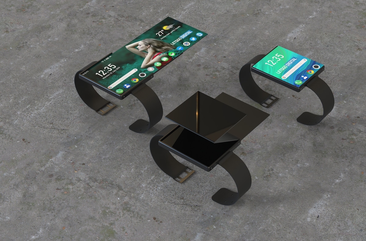
In 2025, foldable devices like the Samsung Galaxy Z Fold, Google Pixel Fold, and various smartwatches are becoming more mainstream. These devices don’t just change the screen size — they change how users interact with websites.
Here’s why it matters:
-
Changing screen real estate: Foldable devices transition between compact and expanded modes.
-
New input methods: Voice commands, gestures, and touch are now common on wearables.
-
User expectations: People expect seamless, adaptive experiences — no matter the device.
If your website isn’t optimized for these scenarios, you risk poor usability, high bounce rates, and missed opportunities.
Step-by-Step Guide: Designing Websites for Foldable and Wearable Screens
Let’s walk through the process of designing responsive, future-ready websites.
Step 1: Understand the Device Ecosystem
Before designing, you need to know your devices. Here’s a breakdown:
-
Foldable screens (e.g., Galaxy Z Fold): Switch between phone-sized and tablet-sized views.
-
Wearables (e.g., Apple Watch, Galaxy Watch, Wear OS devices): Feature small, circular or square displays with limited input options.
-
AR/VR wearables (e.g., Meta Quest, Apple Vision Pro): Support immersive, interactive web experiences.
🔍 Tip: Use emulators or physical devices to test various screen configurations early in the process.
Step 2: Prioritize Progressive Enhancement Over Graceful Degradation
Design from the ground up for smaller and unique screens, then add features for larger displays.
-
Start with a minimal layout for wearable devices.
-
Add functionality for foldable phones (think split screens and dual displays).
-
Scale up to tablets and desktops.
This ensures that your content remains accessible, functional, and engaging on every screen type.
Step 3: Use Responsive and Adaptive Design Principles
While responsive design is standard, it requires fine-tuning for foldables and wearables.
✅ For Foldable Devices:
-
Use media queries for specific screen ratios.
-
Account for hinge areas and multi-window modes.
-
Support continuous layouts when devices unfold or fold.
✅ For Wearables:
-
Prioritize glanceable UI — short, actionable content.
-
Use large touch targets and avoid overcrowding.
-
Optimize for voice input and haptic feedback.
⚠️ Avoid tiny fonts, cluttered layouts, or requiring excessive scrolling.
Step 4: Design for Context-Aware Interactions
Foldables and wearables are often used on-the-go. Your design should reflect this.
-
Time-sensitive content: Prioritize quick access (e.g., check-ins, tracking, messages).
-
Location-based features: Use GPS to personalize user experience (maps, reminders).
-
Battery-aware design: Use lightweight images and lazy-loading to minimize resource use.
On wearables, your goal should be efficiency over depth. If the task is too complex, link to the full experience on a foldable or desktop.
Step 5: Optimize Content Hierarchy and Navigation
On compact screens, you must trim the fat. Focus on:
-
Essential CTAs (e.g., “Buy Now,” “Track Order”)
-
Bite-sized headings and content blocks
-
Icon-driven or gesture-based navigation
For foldables:
-
Design for screen continuity — how a user might begin reading an article on a folded device and continue on the unfolded view without losing their place.
For wearables:
-
Use cards or tiles that users can swipe or scroll through easily.
Step 6: Test Across Real Devices and Emulators
Emulation is helpful but real-device testing is irreplaceable.
-
Test in folded, unfolded, and partially folded states.
-
Check interaction zones — are buttons too close to hinges or corners?
-
Ensure text doesn’t get cut off or misaligned on small circular screens.
Platforms like Samsung Remote Test Lab, Android Studio Emulator, and BrowserStack can help you simulate or access real environments.
Step 7: Stay Aligned with Accessibility Standards
Whether it’s a smartwatch or a foldable phone, accessibility remains critical.
-
Provide screen reader support
-
Use high-contrast visuals
-
Make interactions voice-friendly
-
Ensure navigability with one hand or via assistive tech
🤝 Accessibility isn’t just ethical — it expands your audience reach.
Real-World Use Cases
-
Fitness apps: Wearables can show heart rate, step count, and progress at a glance, while foldables display full workout videos or progress charts.
-
E-commerce: Users browse quick deals on a smartwatch, then unfold their phone for a seamless checkout experience.
-
News & content: Deliver bite-sized headlines on wearables and full articles on larger screens.
The goal is to ensure cohesive and continuous user experiences across all device types.
Frequently Asked Questions
❓ Do foldable devices require separate websites?
No. A responsive, adaptive website can handle most foldable scenarios. However, specific UX enhancements (like supporting dual screens or hinge awareness) may require custom styles or scripts.
❓ Is designing for wearables worth the investment?
Yes, especially if your product or service is time-sensitive, mobile-centric, or data-driven. Wearables offer ultra-fast access to users — perfect for notifications, reminders, or quick actions.
❓ Can I use standard responsive frameworks like Bootstrap?
While frameworks like Bootstrap can help, they weren’t built with foldables or wearables in mind. You may need to customize breakpoints, use newer CSS properties, or implement custom behaviors for multi-screen scenarios.
❓ How do foldables handle orientation changes?
Foldable devices often recalculate viewport dimensions when transitioning from folded to unfolded. Use the resize event and CSS media queries to ensure your layout adapts smoothly.
❓ What tools can help with foldable/wearable web design?
Here are some tools to explore:
-
Android Studio – for foldable emulation
-
Wear OS Emulator – for smartwatch testing
-
Samsung Remote Test Lab – remote access to real devices
-
BrowserStack – responsive design testing
Final Thoughts: The Future of Web Design Is Flexible
Designing websites for foldable and wearable screens isn’t just a trendy checkbox — it’s about creating experiences that are fluid, responsive, and user-first.
As devices become more personalized and mobile, so must your web experiences. By understanding the technology, applying best practices, and embracing adaptability, you’re not just future-proofing your site — you’re making it more inclusive, efficient, and delightful.
🔗 Ready to upgrade your web experience for foldables and wearables?
Start small. Audit your current site. Begin designing modular, responsive elements. And keep testing on real devices.
The future of design is already here — it just folds and fits on your wrist.