Why Some Websites Don’t Open on Mobile: Unraveling the Mobile Compatibility Mystery
In this digital age, mobile devices have become a vital part of our lives, serving as a gateway to a multitude of information, entertainment, and services. But it’s possible that you’ve tried to visit a website from your mobile device and had no luck getting it to load or display properly. In this post, we’ll look at why some websites won’t load on mobile devices and how app developers can fix the problem. Find why some websites dont open on mobile.
The Mobile-First Imperative
Websites need to be mobile-friendly because mobile usage is rapidly overtaking desktop usage. The significance of mobile compatibility is highlighted by Google’s mobile-first indexing technique, which gives search engine rankings preference to the mobile version of a website. When a website doesn’t open or perform correctly on mobile, it can result in a poor user experience, leading to greater bounce rates and a negative influence on a site’s reputation.
1. Lack of Responsive Design
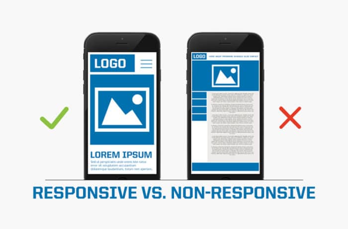
The lack of responsive design is a major factor in why some websites won’t load on mobile devices. With responsive web design, a website automatically reformats itself to look good on any device, regardless of its screen size or orientation. Websites that aren’t responsive can be difficult to use on mobile devices since their layout and content may not scale down well.

How to Address Responsive Design Issues:
Web designers who want to fix the problems with responsive layouts should:
Make use of relative units of measurement (percentages, for example) and adaptable grid layouts.
Use media queries to specify alternative presentation styles for various viewport widths.
Make sure the site works across a variety of platforms and browsers by testing it out.
Websites built with Adobe Flash or other similar obsolete technologies are notoriously difficult for mobile users to access. In 2020, Adobe officially stopped support for Flash, rendering Flash-based websites utterly outdated. Because of this, mobile devices can no longer access or properly display websites with Flash content.
2. Flash-Based or Outdated Technologies
Web designers can fix this by doing the following:
Give up Flash in favor of more up-to-date web standards like HTML5, CSS, and JavaScript.
Make sure all multimedia files (movies, GIFs, etc.) can be played on a mobile device by converting them to an MP4 format, for example.
Maintain a regular audit schedule to find and replace aging equipment.
How to Address Flash-Based or Outdated Technology Issues:
Mobile devices typically have lower processing and data transfer rates than desktop PCs. As a result, sites that are image- and video-heavy or haven’t been optimized for mobile devices may take longer to load or not work at all. When a website takes too long to load, visitors become frustrated and may decide to never return.
Fixing Common Image and Video Quality Issues:
3. Heavy or Unoptimized Images and Videos
Reduce the size of your image files by compressing them with a format like WebP or JPEG 2000.
Lazy loading allows media resources to be downloaded only when they are actually needed, improving page load times.
Avoid sending extra data by using images that automatically resize themselves based on the user’s screen resolution.
Navigation is a key feature of every website, and it becomes much more critical on mobile devices due to restricted screen real estate. Website visitors who are using mobile devices may become frustrated if they are unable to easily navigate the site.
How to Address Image and Video Optimization Issues:
Web designers who want to improve the mobile browsing experience should:
Create a drop-down menu that can be expanded with the click of a button and collapsed with the help of a hamburger icon.
To make it simpler for people to navigate the site with their fingers, utilize larger buttons and links that are optimized for touch.
Use usability testing to make sure the mobile site is easy to navigate.
5. Inadequate Touchscreen Support
In contrast to desktop computers, which are often used with a mouse and keyboard, mobile devices rely heavily on touchscreens for user interaction. Websites that aren’t optimized for touch screens can not load or work properly on mobile browsers.

How to Address Touchscreen Support Issues:
Web designers who want to better accommodate touchscreen devices should:
Make sure that the size of all buttons and links is suitable for touch input.
Eliminate hover-based interactions, as they do not operate on touchscreens.
Make sure all touch interactions on the website are fully functional by testing it on a wide range of mobile devices.
6. Unoptimized Fonts and Text
The appearance and legibility of a website greatly benefit from the use of appropriate web fonts. However, reading challenges on mobile devices might arise from employing non-optimized typefaces or small text sizes, making it difficult for consumers to consume material.
How to Address Font and Text Optimization Issues:
Web developers should do the following to guarantee that text is mobile-friendly:
Make use of web-safe fonts, which can be read by most devices.
Improve readability on mobile devices by adjusting font size and line spacing.
Check the readability of the website’s typeface on a variety of mobile devices.
7. Browser Compatibility
There are several different web browsers available for mobile devices, each with its own set of features and limitations. A poor user experience can be the result of a website that hasn’t been fully tested for browser compatibility.

How to Address Browser Compatibility Issues:
Web designers who want to fix browser compatibility problems should:
The site must be examined in Chrome, Safari, Firefox, and Edge, among other widely used mobile browsers.
Make sure your site works in all major browsers by adhering to web standards and best practices.
Stay informed with the latest browser improvements to adjust the webpage correctly.
8. Mobile Device Limitations
It’s crucial to remember that not every mobile gadget is the same. It’s possible that the processing speed, storage space, and display dimensions of some older or cheaper devices will be constrained. Websites that need a lot of server space or have other technical requirements may not load or function properly on these gadgets.
How to Address Mobile Device Limitations:
Web designers who want to serve customers that use a wide range of mobile devices should:
Remove unneeded animations and sophisticated JavaScript from your website to improve its load time.
If you know your audience includes those using older or less powerful devices, adapt your content accordingly.
Use progressive enhancement as a top priority to guarantee at least some level of functionality across all devices. why some websites dont open on mobile
Conclusion
Now more than ever, it’s important that websites load quickly and operate normally when viewed from a mobile device. Some websites may not load on a mobile device for a variety of reasons, including but not limited to design and technological problems, content optimization and compatibility concerns. Web developers can improve the user experience and increase their site’s exposure in today’s mobile-first era by giving mobile compatibility top billing. https://www.indeed.com/career-advice/career-development/mobile-friendly


